Every Picture Is a Compromise
Lessons from the Also-rans
Most photography websites show the photographer's very best work. Wonderful. But that's not the full story of a creative life. If we want to learn, we'd better pay attention to the images that aren't "greatest hits" and see what lessons they have to offer. Every picture is a compromise — the sum of its parts, optical, technical, visual, emotional, and even cosmic – well, maybe not cosmic, but sometimes spiritual. Success on all fronts is rare. It's ok to learn from those that are not our best.
This is a series about my also-rans, some of which I've been able to improve at bit (i.e., "best effort"), none of which I would consider my best. With each there are lessons worth sharing, so I will.
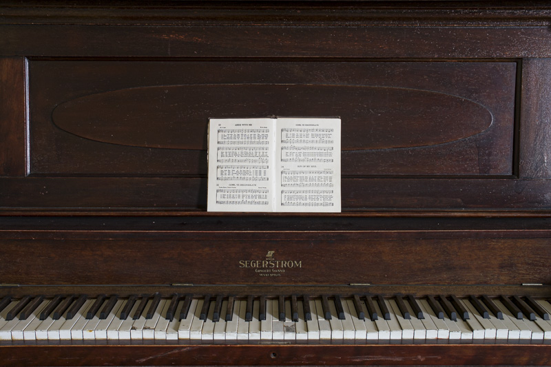
Original digital captureWhat I saw that I liked:Nostalgia on parade. That's an old hymnal on the broken piano. A bit cliché, but not bad. Love the light coming in from the window off-stage right. What I don't like in the picture:The key to this image is that it is a hymnal, not some random book or piano instruction publication. That doesn't come through in this first composition unless you get close enough to read the detailed title on the cover. Why not just open the book? And center it. What I learned:Sometimes our eidetic vision sees a photograph, but other times is only sees a scene that has potential — but needs finessing. I don't mind moving things if it improves the aesthetic in the artwork. I wouldn't do so if I was making a documentary, but in artmaking I think it's perfectly acceptable. 2nd Chances: What I might try nextA nit-picky detail still bothers me. Notice that the verticals are not rectified. Now that this is such an easy thing to fix in Lightroom, I think I'll see if that helps. |


