Every Picture Is a Compromise
Lessons from the Also-rans
Most photography websites show the photographer's very best work. Wonderful. But that's not the full story of a creative life. If we want to learn, we'd better pay attention to the images that aren't "greatest hits" and see what lessons they have to offer. Every picture is a compromise — the sum of its parts, optical, technical, visual, emotional, and even cosmic – well, maybe not cosmic, but sometimes spiritual. Success on all fronts is rare. It's ok to learn from those that are not our best.
This is a series about my also-rans, some of which I've been able to improve at bit (i.e., "best effort"), none of which I would consider my best. With each there are lessons worth sharing, so I will.
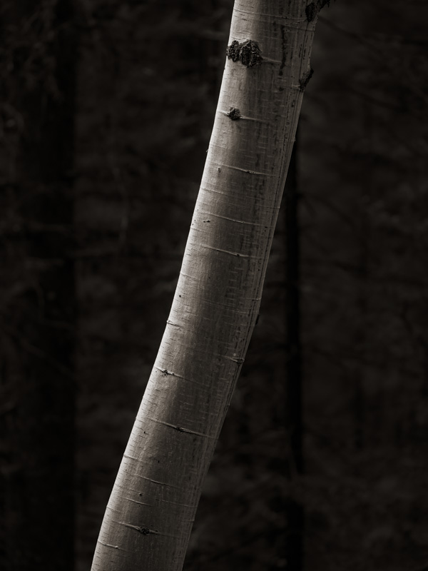
Original digital captureWhat I saw that I liked:Aspens glow. Well, at least those photographed by Ansel Adams glow. What I don't like in the picture:Mine don't glow — and not just this one to the left. I've photographed these lovely trees for years. I've failed to get my aspens to glow for years. I shan't give up, but my patience is starting to wear a little thin. What I learned:Perhaps Ansel Adams was a god after all — or at least a magician, like Merlin. We ordinary folk might be better served by not trying to emulate the images of the masters, but rather to emulate their dedication and commitment to the creative life — and just do the best we can without beating ourselves up with comparisons. Easier said than done. 2nd Chances: What I might try nextI think I can live with the heavily processed version of this image at left, but the composition is boring. Because I have so many images of aspen trunks, maybe the best approach is to find the ones with the best framing/composition first and push them a little more toward an extreme like this one. Might work, but I won't know until I try it. |


