Every Picture Is a Compromise
Lessons from the Also-rans
Most photography websites show the photographer's very best work. Wonderful. But that's not the full story of a creative life. If we want to learn, we'd better pay attention to the images that aren't "greatest hits" and see what lessons they have to offer. Every picture is a compromise — the sum of its parts, optical, technical, visual, emotional, and even cosmic – well, maybe not cosmic, but sometimes spiritual. Success on all fronts is rare. It's ok to learn from those that are not our best.
This is a series about my also-rans, some of which I've been able to improve at bit (i.e., "best effort"), none of which I would consider my best. With each there are lessons worth sharing, so I will.
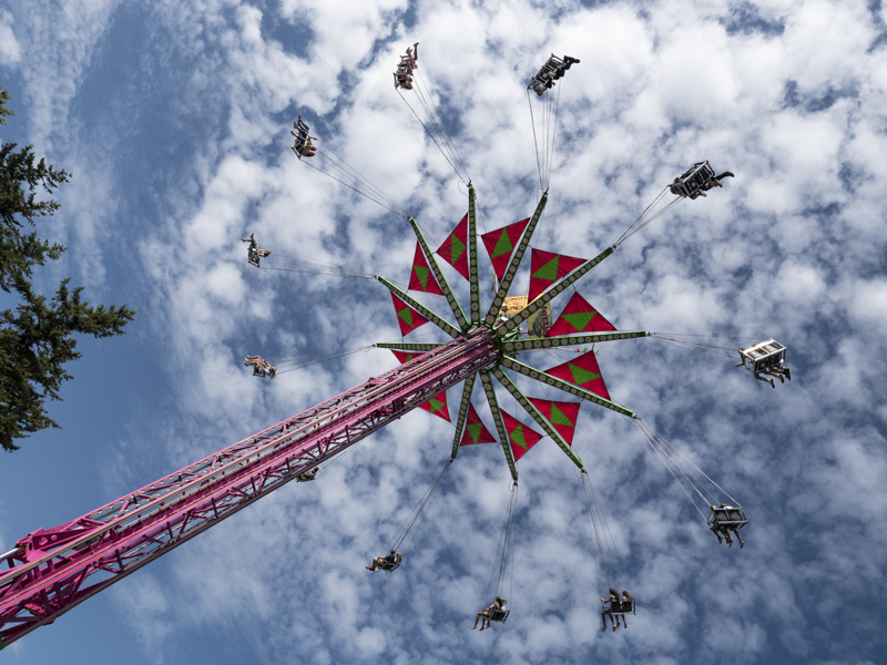
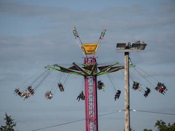
Original digital captureWhat I saw that I liked:Popcorn and cotton candy; lights and music and carnival rides. What's not to like? What I don't like in the picture:I'll tell you what's not to like — the damned telephone pole in the middle of my picture, that's what. Why do I even bother? Did I not see the honkin', out-of-focus pole that was obviously right there in front of me? I know "content aware fill" is good, but this is ridiculous. What I learned:Well, actually, I did see it — but only after I had fired off about 100 shots using burst mode. Geez. However, in my defense, once I chimped and realized my silly mistake, I paid more attention and got the one on the left — which I'm pretty happy with. 2nd Chances: What I might try nextThere are times when a so-called "Dutch angle" is the ideal horizon line and this is one of them. I was so excited about this image, I couldn't wait to get back to the fair this year — but it's canceled due to COVID. Sometimes, as a photographer, it's best to get it while you can. In fact, isn't this just about always true? |


