Every Picture Is a Compromise
Lessons from the Also-rans
Most photography websites show the photographer's very best work. Wonderful. But that's not the full story of a creative life. If we want to learn, we'd better pay attention to the images that aren't "greatest hits" and see what lessons they have to offer. Every picture is a compromise — the sum of its parts, optical, technical, visual, emotional, and even cosmic – well, maybe not cosmic, but sometimes spiritual. Success on all fronts is rare. It's ok to learn from those that are not our best.
This is a series about my also-rans, some of which I've been able to improve at bit (i.e., "best effort"), none of which I would consider my best. With each there are lessons worth sharing, so I will.
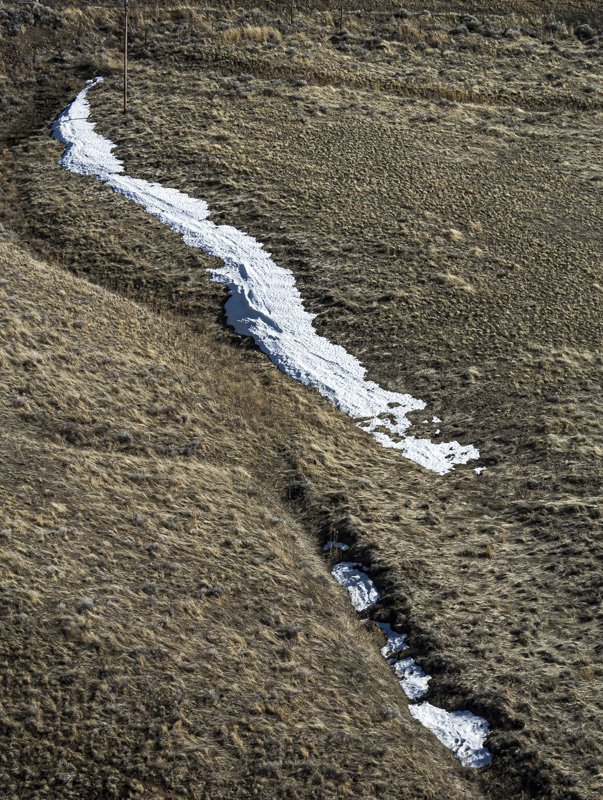
Original digital captureWhat I saw that I liked:I have a very difficult time resisting a diagonal line. What I don't like in the picture:A photograph needs to be about more than just a tidy composition — and this one isn't. What I learned:Here is a functional question I often find useful: What is this photograph about? Not what it is a picture of, but what is the meaning or content that makes it worthy of looking at? A patch of snow on a desert hillside. So what? A lovely photographic composition doesn't add enough to salvage this one. A photograph without content is like a concert pianist playing the scales — it might demonstrate some sort of competence, but you wouldn't pay to attend the performance. 2nd Chances: What I might try nextDriving by. Or taking more time while I'm there to find the content that I missed with this one. |


