Every Picture Is a Compromise
Lessons from the Also-rans
Most photography websites show the photographer's very best work. Wonderful. But that's not the full story of a creative life. If we want to learn, we'd better pay attention to the images that aren't "greatest hits" and see what lessons they have to offer. Every picture is a compromise — the sum of its parts, optical, technical, visual, emotional, and even cosmic – well, maybe not cosmic, but sometimes spiritual. Success on all fronts is rare. It's ok to learn from those that are not our best.
This is a series about my also-rans, some of which I've been able to improve at bit (i.e., "best effort"), none of which I would consider my best. With each there are lessons worth sharing, so I will.
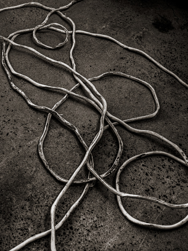
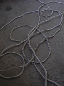
Original digital captureWhat I saw that I liked:I'm a sucker for lines that can be organized into a sort of abstract. This is a power cord on the floor of a factory in China I visited in 2019. Click! Maybe I can do something with it later. What I don't like in the picture:The original above isn't well exposed and is too flat. Needs contrast. Easy enough, but also . . . What I learned:I felt that small circle in the upper right of the original was some sort of focal point of this composition and I wasn't crazy about it being in the upper right. Flopping the image and some tonal control helps. Still not great, but it was fun to play with it to see if I could move closer to something useable. 2nd Chances: What I might try nextThis image needs a title. Something Picasso-esque. "Pregnant woman playing the cello." Well, maybe not. |


