Every Picture Is a Compromise
Lessons from the Also-rans
Most photography websites show the photographer's very best work. Wonderful. But that's not the full story of a creative life. If we want to learn, we'd better pay attention to the images that aren't "greatest hits" and see what lessons they have to offer. Every picture is a compromise — the sum of its parts, optical, technical, visual, emotional, and even cosmic – well, maybe not cosmic, but sometimes spiritual. Success on all fronts is rare. It's ok to learn from those that are not our best.
This is a series about my also-rans, some of which I've been able to improve at bit (i.e., "best effort"), none of which I would consider my best. With each there are lessons worth sharing, so I will.
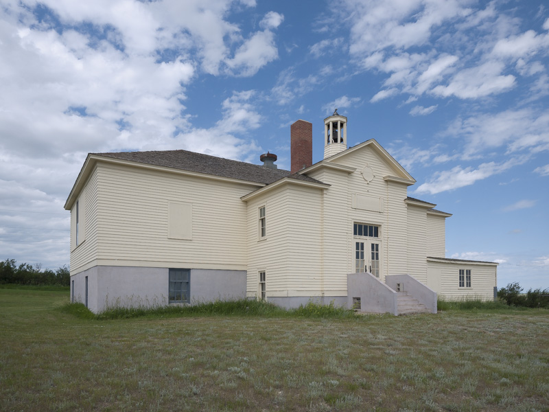
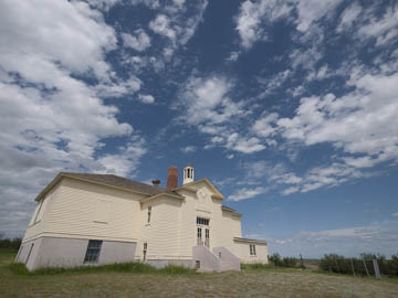
Original digital captureWhat I saw that I liked:You can barely see in the small image above that there is a playground swing and slide in the lower right corner. I wanted that play area and school both to be in the shot. What I don't like in the picture:Ultra-wides are great for getting it all in, but they do so at the cost of rectilinear distortion. I know the wind is strong in North Dakota, but not strong enough to tilt a school like this. Pretty sure, anyway. What I learned:The image at left is rectified. Rectified and boring. Without the swing and slide, it's just a building. Who cares? 2nd Chances: What I might try nextIf I am ever back there again, I'll do a jigsaw composite. That could be cool. |


