Every Picture Is a Compromise
Lessons from the Also-rans
Most photography websites show the photographer's very best work. Wonderful. But that's not the full story of a creative life. If we want to learn, we'd better pay attention to the images that aren't "greatest hits" and see what lessons they have to offer. Every picture is a compromise — the sum of its parts, optical, technical, visual, emotional, and even cosmic – well, maybe not cosmic, but sometimes spiritual. Success on all fronts is rare. It's ok to learn from those that are not our best.
This is a series about my also-rans, some of which I've been able to improve at bit (i.e., "best effort"), none of which I would consider my best. With each there are lessons worth sharing, so I will.
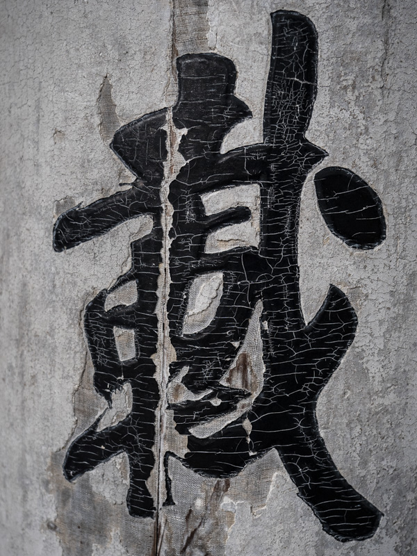
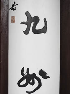
Original digital captureWhat I saw that I liked:The minute I entered the library Tianyi-gu in Ningbo, China, I knew I wanted to photograph the old calligraphy on the support beams that were everywhere. What I don't like in the picture:The one above was my first exposure, rarely the one I end up using. Too much space between the characters, too new-looking, and too flat so that it doesn't look like it's on a round beam. What I learned:Keep working the idea. I probably made a hundred of these images of various calligraphy characters in various rooms and courtyards. There will be a project here once I figure out what it is. At least this one at left show the antiquity and the sense of the curved beam it is written on. 2nd Chances: What I might try nextThis project needs a processing "style" and at this point, I don't have any idea what that will be. Keep working the idea. . . |


