Every Picture Is a Compromise
Lessons from the Also-rans
Most photography websites show the photographer's very best work. Wonderful. But that's not the full story of a creative life. If we want to learn, we'd better pay attention to the images that aren't "greatest hits" and see what lessons they have to offer. Every picture is a compromise — the sum of its parts, optical, technical, visual, emotional, and even cosmic – well, maybe not cosmic, but sometimes spiritual. Success on all fronts is rare. It's ok to learn from those that are not our best.
This is a series about my also-rans, some of which I've been able to improve at bit (i.e., "best effort"), none of which I would consider my best. With each there are lessons worth sharing, so I will.
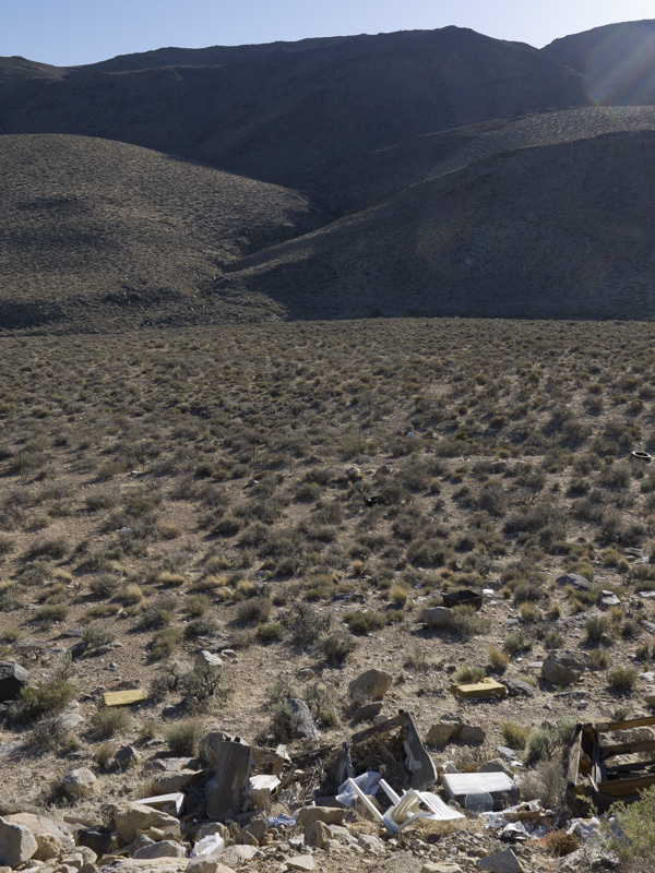
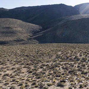
Original digital captureWhat I saw that I liked:With the exception of some serious flare in the upper right corner, a nice (not spectacular) desert scene. What I don't like in the picture:The original is essentially a lie. It's what we landscape photographers often do — we creatively position our camera and/or crop out the unpleasant truth. See the image at left. What I learned:It is often said that art is all about "truth" and "beauty." These are often not the same thing. So which do I show, the "truth" or the "beauty"? I guess it depends on our personal philosophy and the objectives of our art. 2nd Chances: What I might try nextIf I had the courage of my convictions, I'd clean up the trash left by others and restore the beauty. Unfortunately, I'm too busy "making art" and just leave it for others to clean up. Which probably will never happen. That's the truth. |


