Every Picture Is a Compromise
Lessons from the Also-rans
Most photography websites show the photographer's very best work. Wonderful. But that's not the full story of a creative life. If we want to learn, we'd better pay attention to the images that aren't "greatest hits" and see what lessons they have to offer. Every picture is a compromise — the sum of its parts, optical, technical, visual, emotional, and even cosmic – well, maybe not cosmic, but sometimes spiritual. Success on all fronts is rare. It's ok to learn from those that are not our best.
This is a series about my also-rans, some of which I've been able to improve at bit (i.e., "best effort"), none of which I would consider my best. With each there are lessons worth sharing, so I will.
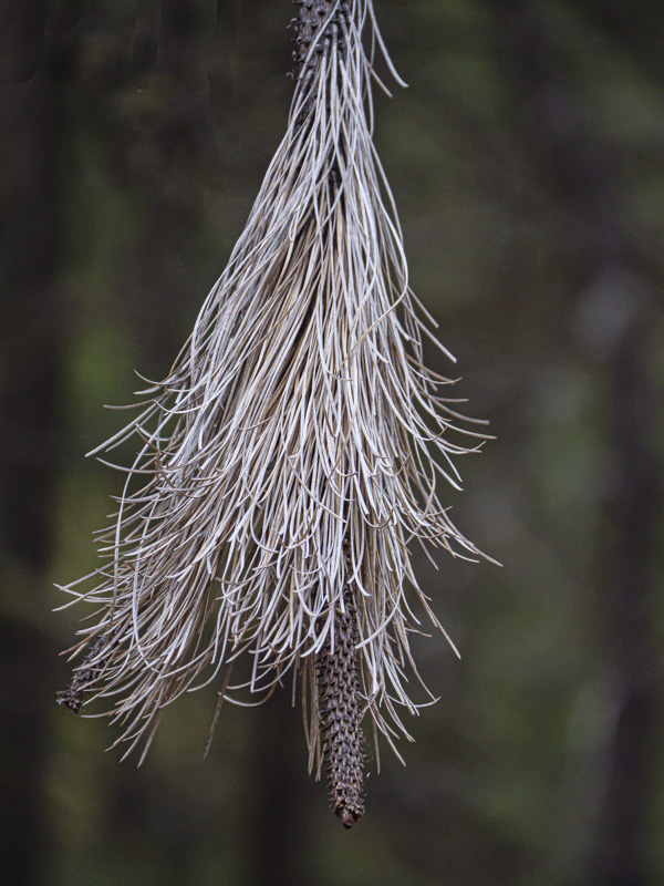
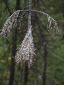
Original digital captureWhat I saw that I liked:I all my years exploring in the Cascades, I've never seen this phenomenon. What I don't like in the picture:Tilt. Left edge. Background three trees. Too much on the bottom. What I learned:More is not always better. The simpler composition at left tells enough without needing to clutter things up with the superfluous elements of the one above. 2nd Chances: What I might try nextI should see how this looks in b/w. Might be better, might not. |


