Every Picture Is a Compromise
Lessons from the Also-rans
Most photography websites show the photographer's very best work. Wonderful. But that's not the full story of a creative life. If we want to learn, we'd better pay attention to the images that aren't "greatest hits" and see what lessons they have to offer. Every picture is a compromise — the sum of its parts, optical, technical, visual, emotional, and even cosmic – well, maybe not cosmic, but sometimes spiritual. Success on all fronts is rare. It's ok to learn from those that are not our best.
This is a series about my also-rans, some of which I've been able to improve at bit (i.e., "best effort"), none of which I would consider my best. With each there are lessons worth sharing, so I will.
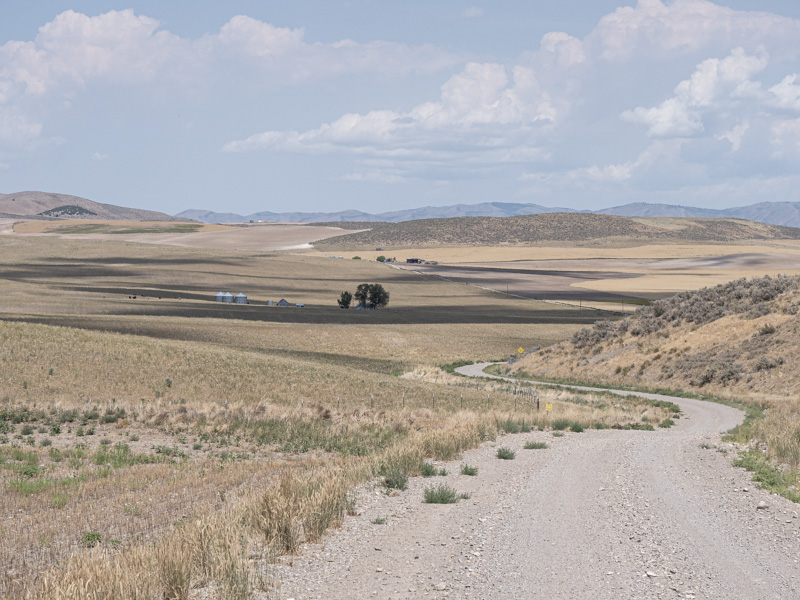
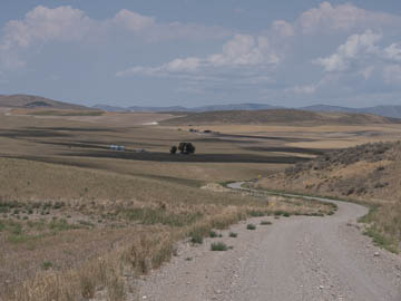
Original digital captureWhat I saw that I liked:Road, shadows, clouds. Nice formula, but a boring photograph. What I don't like in the picture:The real reason I wanted to include this image has nothing to do with the content. It has to do with the tilt. Everytime I shoot a landscape, my default is to level the camera using the internal level indicator. I did that with this exposure, too. Then why to my eye does the image seem to lean to the right? What I learned:"Physical level" is not always the same as "optical level." The image at left seems level to me because I tilted the original "physically level" image a tad to the left. According to Lightroom, -0.91°. I'm not so sure I couldn't go a tad more than that, truth be told. 2nd Chances: What I might try nextUse the tools (e.g., leveler), but trust your eye. |


