Every Picture Is a Compromise
Lessons from the Also-rans
Most photography websites show the photographer's very best work. Wonderful. But that's not the full story of a creative life. If we want to learn, we'd better pay attention to the images that aren't "greatest hits" and see what lessons they have to offer. Every picture is a compromise — the sum of its parts, optical, technical, visual, emotional, and even cosmic – well, maybe not cosmic, but sometimes spiritual. Success on all fronts is rare. It's ok to learn from those that are not our best.
This is a series about my also-rans, some of which I've been able to improve at bit (i.e., "best effort"), none of which I would consider my best. With each there are lessons worth sharing, so I will.
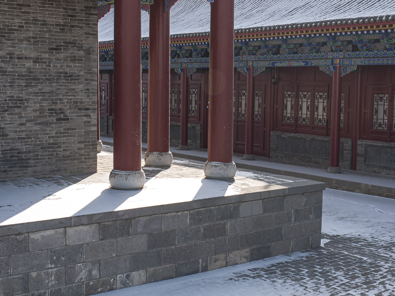
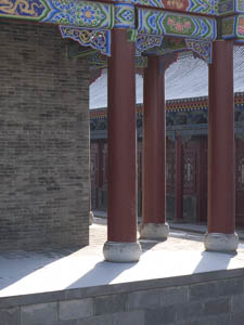
Original digital captureWhat I saw that I liked:In a Chinese temple, wonderful red columns and those shadows on the skiff of snow. What I don't like in the picture:My knee-jerk reaction to composition is to generally choose portrait orientation for vertical subjects. It's amazing how many times that is exactly the wrong choice. What I learned:It's not the dominant object that should determine portrait or landscape orientation, but the overall balance and eye movement throughout the composition that should be the deciding factor. 2nd Chances: What I might try nextThose two little dots of light in the dead center need to be spotted out. Maybe some of the dots of white in the red columns, too. |


