Every Picture Is a Compromise
Lessons from the Also-rans
Most photography websites show the photographer's very best work. Wonderful. But that's not the full story of a creative life. If we want to learn, we'd better pay attention to the images that aren't "greatest hits" and see what lessons they have to offer. Every picture is a compromise — the sum of its parts, optical, technical, visual, emotional, and even cosmic – well, maybe not cosmic, but sometimes spiritual. Success on all fronts is rare. It's ok to learn from those that are not our best.
This is a series about my also-rans, some of which I've been able to improve at bit (i.e., "best effort"), none of which I would consider my best. With each there are lessons worth sharing, so I will.
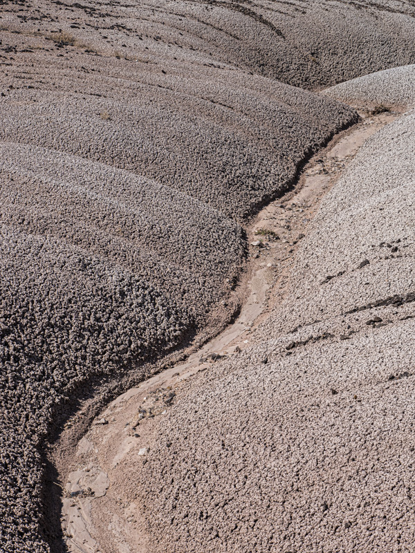
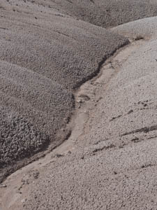
Original digital captureWhat I saw that I liked:Nice diagonal erosion through the light colored bentonite. What I don't like in the picture:Why did I terminate the erosion flow out the left side of the image? That's awkward. What I learned:Just a slight reframe and the erosion channel exits the bottom of the image. Better. Great? Not really, but better is still better. 2nd Chances: What I might try nextSure could have used a stronger shadow in this one. If I'd just waited a few hours. ; —) |


