Every Picture Is a Compromise
Lessons from the Also-rans
Most photography websites show the photographer's very best work. Wonderful. But that's not the full story of a creative life. If we want to learn, we'd better pay attention to the images that aren't "greatest hits" and see what lessons they have to offer. Every picture is a compromise — the sum of its parts, optical, technical, visual, emotional, and even cosmic – well, maybe not cosmic, but sometimes spiritual. Success on all fronts is rare. It's ok to learn from those that are not our best.
This is a series about my also-rans, some of which I've been able to improve at bit (i.e., "best effort"), none of which I would consider my best. With each there are lessons worth sharing, so I will.
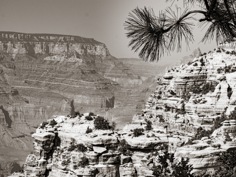
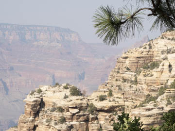
Original digital captureWhat I saw that I liked:Pines at the Grand Canyon. Must be something I can do with that! What I don't like in the picture:I wanted to try the De-haze slider in Lightroom with my images from the Grand Canyon. Sometimes you just have to have a good laugh when everything that can go wrong, does goes wrong.
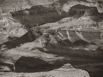
What I learned:The preset I'd developed for this project that was doing a great job with the haze with lots of my images of the Grand Canyon. For example . . . But just because a preset or processing tactic works with one image doens't mean it will work will all images. 2nd Chances: What I might try nextFind another pine tree and start over. |


