Every Picture Is a Compromise
Lessons from the Also-rans
Most photography websites show the photographer's very best work. Wonderful. But that's not the full story of a creative life. If we want to learn, we'd better pay attention to the images that aren't "greatest hits" and see what lessons they have to offer. Every picture is a compromise — the sum of its parts, optical, technical, visual, emotional, and even cosmic – well, maybe not cosmic, but sometimes spiritual. Success on all fronts is rare. It's ok to learn from those that are not our best.
This is a series about my also-rans, some of which I've been able to improve at bit (i.e., "best effort"), none of which I would consider my best. With each there are lessons worth sharing, so I will.
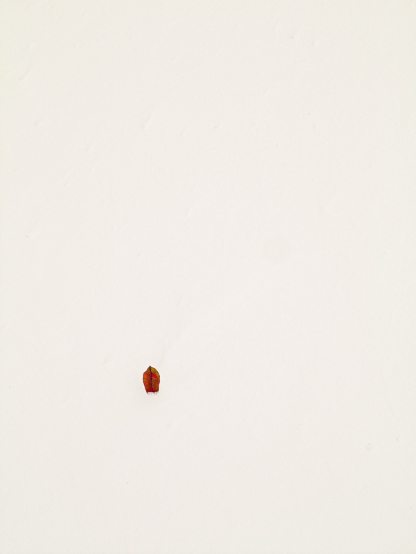
Original digital captureWhat I saw that I liked:A single leaf on the snow just about defines minimalism, at least it does so to me. What I don't like in the picture:I think I got carried away with this one. The snow doesn't look like snow (light too flat) and the leaf doesn't look like a leaf (too small to decipher what it is). What I learned:Any technique — including minimalism — can become absurd when pushed too far. This is too far. I like the spirit of the image, just not the execution. 2nd Chances: What I might try nextCrop? |


