Every Picture Is a Compromise
Lessons from the Also-rans
Most photography websites show the photographer's very best work. Wonderful. But that's not the full story of a creative life. If we want to learn, we'd better pay attention to the images that aren't "greatest hits" and see what lessons they have to offer. Every picture is a compromise — the sum of its parts, optical, technical, visual, emotional, and even cosmic – well, maybe not cosmic, but sometimes spiritual. Success on all fronts is rare. It's ok to learn from those that are not our best.
This is a series about my also-rans, some of which I've been able to improve at bit (i.e., "best effort"), none of which I would consider my best. With each there are lessons worth sharing, so I will.
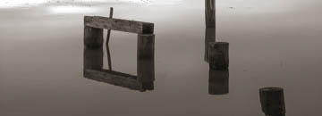
Original digital captureWhat I saw that I liked:Geometric shapes with reflections in the water. What I don't like in the picture:Elsewhere, I've mentioned my "rule of threes" — not thirds, but threes. This has nothing to do with geometry, but rather that a picture needs three elements to really make it work. In this case, the shapes are the first element, the water/reflections are the second element. And . . . that's it. What I learned:But waiting just a few minutes (in the coastal Pacific Northwest the weather is always changing) and the rain came. There was the third element I was missing — raindrops. This business of three elements doesn't always work, but it's amazing how many times that third element improves an image. 2nd Chances: What I might try nextI wonder what it would look like if half of the image had raindrops and the other half didn't? As if the rain was passing overhead and half of the image had clear reflections. Hmmm. . . . |


