Every Picture Is a Compromise
Lessons from the Also-rans
Most photography websites show the photographer's very best work. Wonderful. But that's not the full story of a creative life. If we want to learn, we'd better pay attention to the images that aren't "greatest hits" and see what lessons they have to offer. Every picture is a compromise — the sum of its parts, optical, technical, visual, emotional, and even cosmic – well, maybe not cosmic, but sometimes spiritual. Success on all fronts is rare. It's ok to learn from those that are not our best.
This is a series about my also-rans, some of which I've been able to improve at bit (i.e., "best effort"), none of which I would consider my best. With each there are lessons worth sharing, so I will.
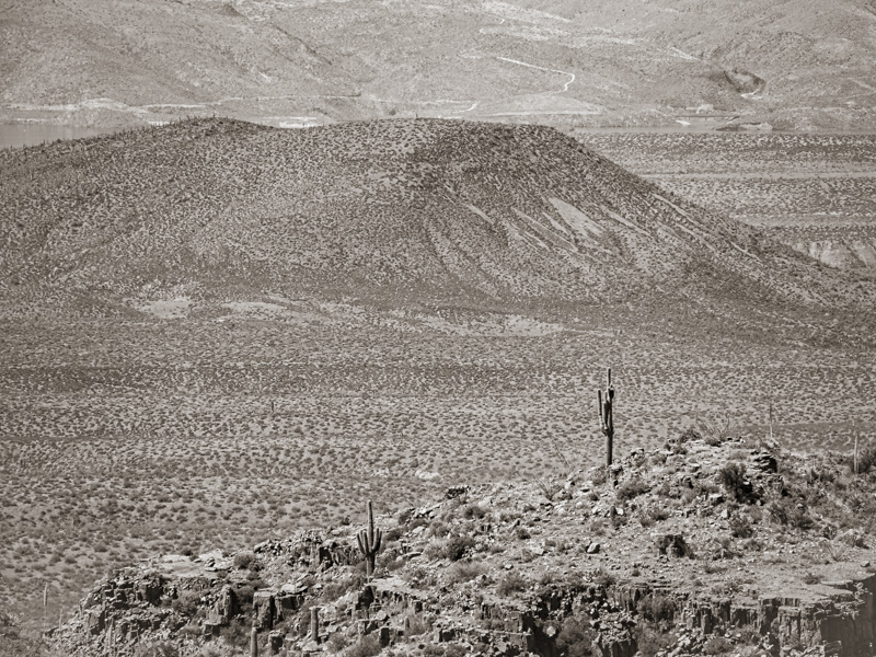
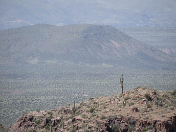
Original digital captureWhat I saw that I liked:A classic near/far composition. What I don't like in the picture:This is an example of why I shy away from previsualization — I'm just not very good at it. I knew I wanted this to be a b/w image and I also knew I could use the De-haze tool in Lightroom to reduce the haze. What I didn't anticipate was how those two post-processing moves would flatten the image and merge the foreground and background into an indistinguishable gray. What I learned:Some photographers have the ability to accurately anticipate how post-processing will render an image. I know that I don't. I'm much better served by letting go of the entire concept of pre-visualization as taught by Ansel Adams and just allow myself to play with an image until it feels right, even if that means it ends up being completely different than I originally thought. 2nd Chances: What I might try nextSplit color and b/w? Blur the background? Negative de-haze? Lots to explore with this one. The only thing I know for sure is the one at left isn't it. |


