Every Picture Is a Compromise
Lessons from the Also-rans
Most photography websites show the photographer's very best work. Wonderful. But that's not the full story of a creative life. If we want to learn, we'd better pay attention to the images that aren't "greatest hits" and see what lessons they have to offer. Every picture is a compromise — the sum of its parts, optical, technical, visual, emotional, and even cosmic – well, maybe not cosmic, but sometimes spiritual. Success on all fronts is rare. It's ok to learn from those that are not our best.
This is a series about my also-rans, some of which I've been able to improve at bit (i.e., "best effort"), none of which I would consider my best. With each there are lessons worth sharing, so I will.
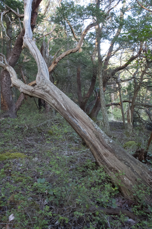
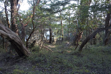
Original digital captureWhat I saw that I liked:In 2006, I purchased a new ultra-wide lens. I took a walk in the woods looking for subjects to test with this new lens. The one above is the first shot. What I don't like in the picture:This was my first clue that these lenses are mis-named. "Wide" is not their virtue, as can clearly be seen in the image above. What I learned:I next made the image at left. This was the first time I realized I might think of this lens as being "ultra-deep" rather than ultra-wide. Also, using this lens to go wide means the items on the left and right are stretched and therefore emphasized, but it also can reduce the size of things in the middle and make them look smaller and farther away. 2nd Chances: What I might try nextI've never used either of these images because I tend to think of them as just test images. Maybe I need to explore this way of seeing the woods more earnestly. |


