Every Picture Is a Compromise
Lessons from the Also-rans
Most photography websites show the photographer's very best work. Wonderful. But that's not the full story of a creative life. If we want to learn, we'd better pay attention to the images that aren't "greatest hits" and see what lessons they have to offer. Every picture is a compromise — the sum of its parts, optical, technical, visual, emotional, and even cosmic – well, maybe not cosmic, but sometimes spiritual. Success on all fronts is rare. It's ok to learn from those that are not our best.
This is a series about my also-rans, some of which I've been able to improve at bit (i.e., "best effort"), none of which I would consider my best. With each there are lessons worth sharing, so I will.
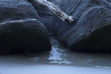
Original digital captureWhat I saw that I liked:Let's all agree right now that both of these are pretty bad photographs — that's a given. But there is a point to be made. Traditional photography:For decade after decade, photography was mostly a matter of selecting the subject, setting the frame edges, composing, and exposing. How quaint. To stretch the boundaries, we could (a daring move!) use a long exposure to make something hopefully more interesting. How quaint. Photography today:Multiple exposure layered images, focus stacking or Photoshop blurs, sequences presented at triptychs or grids, recombinant images, panorama images, fake colors, mixed b/w and color — need I go on? The idea of composing and clicking seems so, well, simple, perhaps even archaic. An image like the one at left used be kinda cool, even innovative. Now is seems like the work of a first term student. What to do?Remember that technique is only a means to an end — and the end had better not be bragging about the technique. Tempus fugit, and anything that seems like a neat trick today will seem like a trite gimmick in the future. |


