Every Picture Is a Compromise
Lessons from the Also-rans
Most photography websites show the photographer's very best work. Wonderful. But that's not the full story of a creative life. If we want to learn, we'd better pay attention to the images that aren't "greatest hits" and see what lessons they have to offer. Every picture is a compromise — the sum of its parts, optical, technical, visual, emotional, and even cosmic – well, maybe not cosmic, but sometimes spiritual. Success on all fronts is rare. It's ok to learn from those that are not our best.
This is a series about my also-rans, some of which I've been able to improve at bit (i.e., "best effort"), none of which I would consider my best. With each there are lessons worth sharing, so I will.
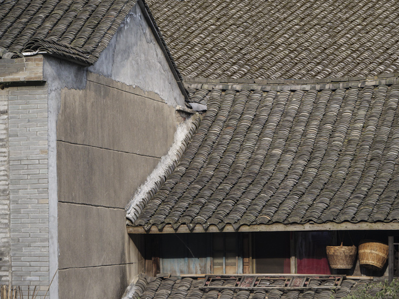
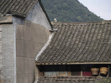
Original digital captureWhat I saw that I liked:Roof tiles, the two buildings, the baskets What I don't like in the picture:The hillside and the sky ruin this image. Period. Gotta go, but how? Sometimes, emergency measures need to be embraced to try to salvage an image. What I learned:After looking at this image for a couple of years, it occurred to me that I could paint in some tiles to cover the hillside and the sky. Maybe make it look like there is another building — a taller one — in back. The question is: Can I do it so that it's believable? Without believability, it's a loser. I searched for an image with suitable tiles that I thought might believable and the one at left is the best I've come up with. So far. I'm still stewing on this one. 2nd Chances: What I might try nextI could also try the Sky Replacement tool. Might be a good idea. |


