Every Picture Is a Compromise
Lessons from the Also-rans
Most photography websites show the photographer's very best work. Wonderful. But that's not the full story of a creative life. If we want to learn, we'd better pay attention to the images that aren't "greatest hits" and see what lessons they have to offer. Every picture is a compromise — the sum of its parts, optical, technical, visual, emotional, and even cosmic – well, maybe not cosmic, but sometimes spiritual. Success on all fronts is rare. It's ok to learn from those that are not our best.
This is a series about my also-rans, some of which I've been able to improve at bit (i.e., "best effort"), none of which I would consider my best. With each there are lessons worth sharing, so I will.
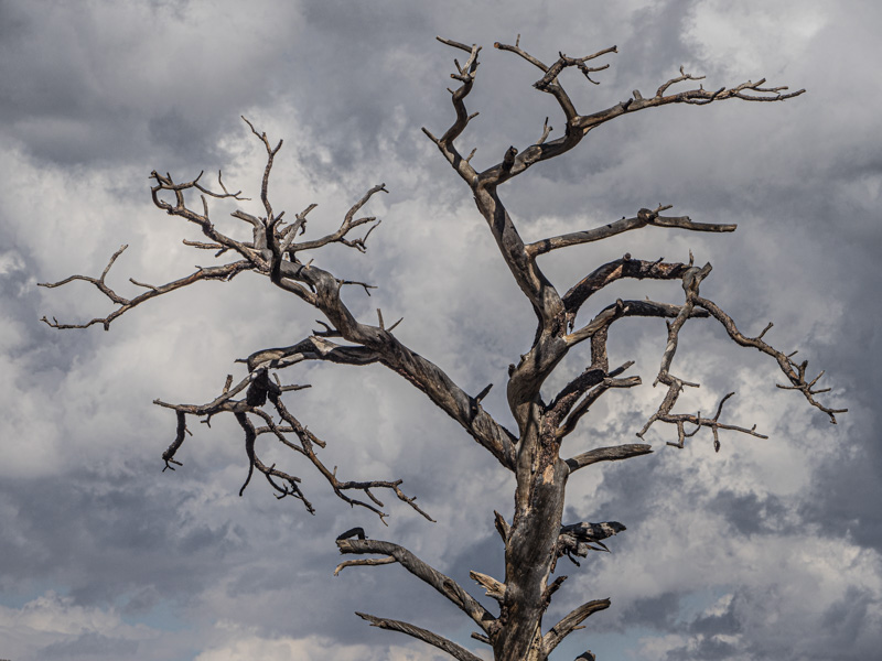
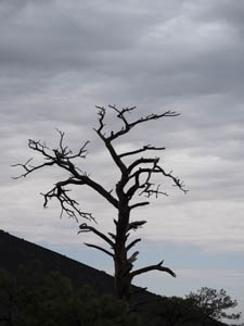
Original digital captureWhat I saw that I liked:Great shape on this dead tree! What I don't like in the picture:The one above is okay, but the total silhouette was not ideal. What I learned:Fortunately, the next day I caught it in direct sun — and with better clouds. Yay. But, is it the right decision to have it leaning to the right? Seems like it really should be straight. Rectifying it, however cuts off some of the branches on the edge, which I don't like at all. 2nd Chances: What I might try nextI need to move this one into Photoshop and see if Content-Aware fill can allow me to rotate it without losing the edges. I just hate having to do all this kind of recovery work when a minute of careful composing would have solved it so easily. |


