Every Picture Is a Compromise
Lessons from the Also-rans
Most photography websites show the photographer's very best work. Wonderful. But that's not the full story of a creative life. If we want to learn, we'd better pay attention to the images that aren't "greatest hits" and see what lessons they have to offer. Every picture is a compromise — the sum of its parts, optical, technical, visual, emotional, and even cosmic – well, maybe not cosmic, but sometimes spiritual. Success on all fronts is rare. It's ok to learn from those that are not our best.
This is a series about my also-rans, some of which I've been able to improve at bit (i.e., "best effort"), none of which I would consider my best. With each there are lessons worth sharing, so I will.
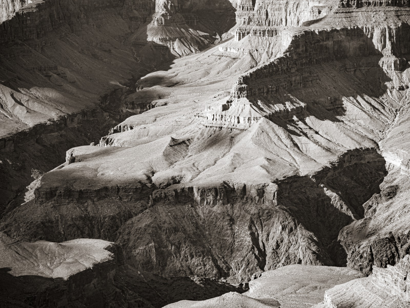
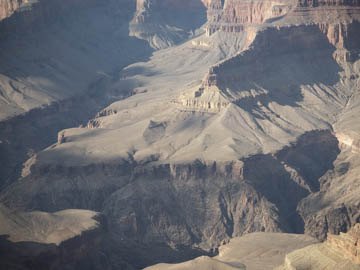
Original digital captureWhat I saw that I liked:It's the Grand Canyon — what's not to like? What I don't like in the picture:I can answer that. The haze that obscures the clarity of the scene plus adds that odd color tint. What I learned:In my film days and even in my early digital days, this would be a loser. My natural inclination would be to toss out the negative or delete the digital file. But then I would remember that technology is constantly changing. Some improvement that would have been impossible yesteryear might be easy to accomplish today. That's the case with the version at left which was easily created from the above using basic tools in Lightroom. The lesson: never, ever delete a file because you can't make it work today. The very tool you need to fix an image might be just around the software corner. |


