Every Picture Is a Compromise
Lessons from the Also-rans
Most photography websites show the photographer's very best work. Wonderful. But that's not the full story of a creative life. If we want to learn, we'd better pay attention to the images that aren't "greatest hits" and see what lessons they have to offer. Every picture is a compromise — the sum of its parts, optical, technical, visual, emotional, and even cosmic – well, maybe not cosmic, but sometimes spiritual. Success on all fronts is rare. It's ok to learn from those that are not our best.
This is a series about my also-rans, some of which I've been able to improve at bit (i.e., "best effort"), none of which I would consider my best. With each there are lessons worth sharing, so I will.
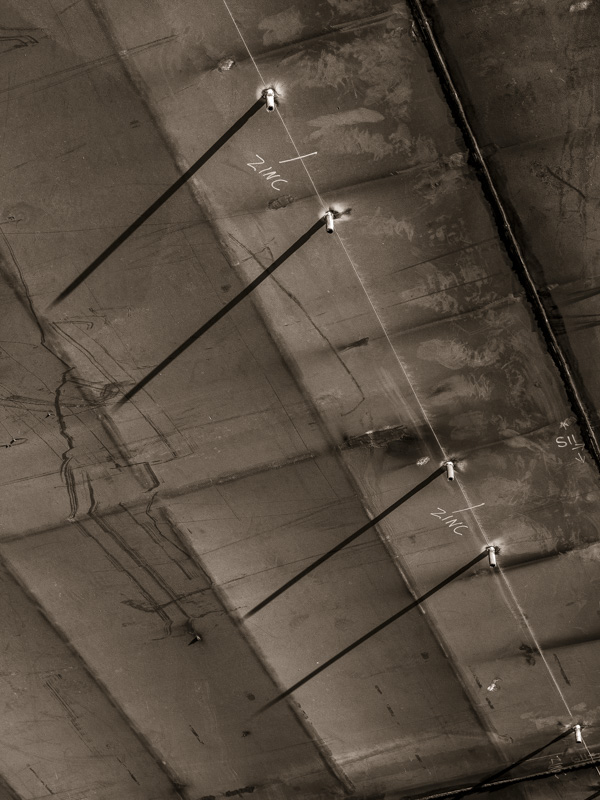
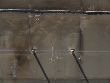
Original digital captureWhat I saw that I liked:These pins sticking out of the hull that are casting dark shadow lines on the surface. What I don't like in the picture:Why did I think photographing straight down on the pins was the answer? They completely loose their three dimensionality. What I learned:I found a better angle (at left) that at least show the pins are the source of the shadow. Not a fantastic image, but better than my first attempt. 2nd Chances: What I might try nextToo bad there isn't something larger to cast an even bigger shadow that would give this image some context. Could I add that in Photoshop? |


