Every Picture Is a Compromise
Lessons from the Also-rans
Most photography websites show the photographer's very best work. Wonderful. But that's not the full story of a creative life. If we want to learn, we'd better pay attention to the images that aren't "greatest hits" and see what lessons they have to offer. Every picture is a compromise — the sum of its parts, optical, technical, visual, emotional, and even cosmic – well, maybe not cosmic, but sometimes spiritual. Success on all fronts is rare. It's ok to learn from those that are not our best.
This is a series about my also-rans, some of which I've been able to improve at bit (i.e., "best effort"), none of which I would consider my best. With each there are lessons worth sharing, so I will.
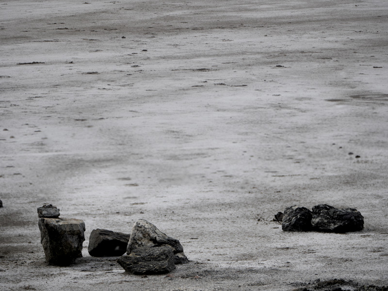
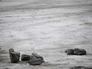
Original digital captureWhat I saw that I liked:I like these kinds of compositions. A sort of minimalism suited to the America southwest. What I don't like in the picture:Ideally, I'd like it all tack sharp. Depth of field is one approach, but the better solution is to do a stitched focus blend. So I made two exposures at different focal distances knowing I'd blend them in Photoshop. What I learned:Two exposures isn't always enough. In the blended image at left, the middle distances aren't sharp because neither of the two exposures were sharp at that distance. New rule of thumb: do three exposures for focus blends. Even if you don't use it, it's better to have it and not need it, than need it and not have it. 2nd Chances: What I might try nextCould I cleverly cut out the middle and blend just the top and bottom? I'll never know until I try. |


