Every Picture Is a Compromise
Lessons from the Also-rans
Most photography websites show the photographer's very best work. Wonderful. But that's not the full story of a creative life. If we want to learn, we'd better pay attention to the images that aren't "greatest hits" and see what lessons they have to offer. Every picture is a compromise — the sum of its parts, optical, technical, visual, emotional, and even cosmic – well, maybe not cosmic, but sometimes spiritual. Success on all fronts is rare. It's ok to learn from those that are not our best.
This is a series about my also-rans, some of which I've been able to improve at bit (i.e., "best effort"), none of which I would consider my best. With each there are lessons worth sharing, so I will.
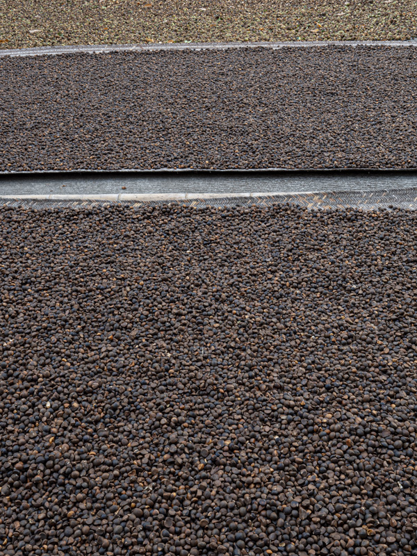
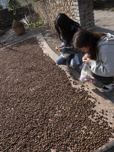
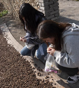
Original digital captureWhat I saw that I liked:Drying seeds in a Chinese market. What I don't like in the picture:I was in the market to photograph the market. Including these two people in the shot seemed, well, market-like. But it's not a very interesting photograph, I think you'll agree. I needed to get closer to see the seeds in their hands. Something like this might have been better.
What I learned:The image I really like from this moment is the abstract at left. This is one of the reasons I love doing abstracts — you can do them anywhere, any time. Instead of a story-image, abstracts are a sort of visual puzzle. Completely different mindset in making the photograph, and completely out of place and time. 2nd Chances: What I might try nextShouldl I leave that top section of the abstract in? Does it add something important, or just distract? |


