Every Picture Is a Compromise
Lessons from the Also-rans
Most photography websites show the photographer's very best work. Wonderful. But that's not the full story of a creative life. If we want to learn, we'd better pay attention to the images that aren't "greatest hits" and see what lessons they have to offer. Every picture is a compromise — the sum of its parts, optical, technical, visual, emotional, and even cosmic – well, maybe not cosmic, but sometimes spiritual. Success on all fronts is rare. It's ok to learn from those that are not our best.
This is a series about my also-rans, some of which I've been able to improve at bit (i.e., "best effort"), none of which I would consider my best. With each there are lessons worth sharing, so I will.
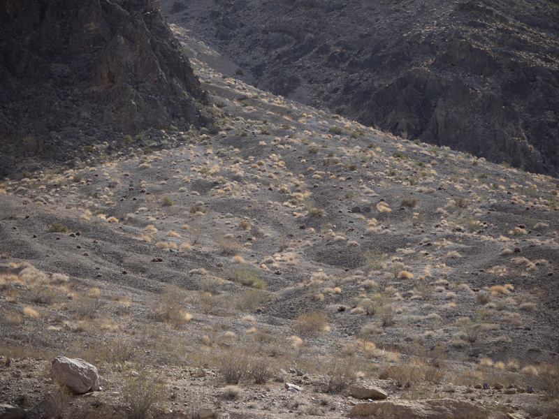
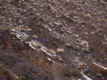
Original digital captureWhat I saw that I liked:Today's images are all about corners. The one above had nothing in the corners; the one at left has that nice boulder in the corner. What I don't like in the picture:Both of these images are unprocessed RAW captures and both are pretty blah in terms of tonalities. What I learned:It's great when a scene is lit to perfection, but that just doesn't happen very often. The thing is, we can pretty easily adjust tones at will with today's digital processing tools. In my youth, if the light wasn't right — or at least close to right — I wouldn't make the exposure. Photography today is different in that the composition is the thing that takes priority about making the exposure or not. I can play around with the tones in the one at left and probably make something interesting — because of that rock and the aluvial fan above it. I don't like the tones, but I do like the geometries of the composition. The one above just doesn't have it, so I'll probably not give it much effort. 2nd Chances: What I might try nextI suppose I could clone in a mountain goat in the corner of the one above. I'll deny I ever said that. |


