Every Picture Is a Compromise
Lessons from the Also-rans
Most photography websites show the photographer's very best work. Wonderful. But that's not the full story of a creative life. If we want to learn, we'd better pay attention to the images that aren't "greatest hits" and see what lessons they have to offer. Every picture is a compromise — the sum of its parts, optical, technical, visual, emotional, and even cosmic – well, maybe not cosmic, but sometimes spiritual. Success on all fronts is rare. It's ok to learn from those that are not our best.
This is a series about my also-rans, some of which I've been able to improve at bit (i.e., "best effort"), none of which I would consider my best. With each there are lessons worth sharing, so I will.
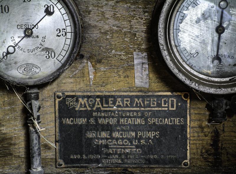
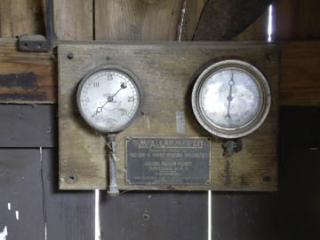
Original digital captureWhat I saw that I liked:Old gauges in an abandoned garage. What I don't like in the picture:The first image (above) is . . . what word can I use to describe it? It's undistilled, dilute, unconcentrated, lacking impact, conceptually imprecise. Something like that, anyway. It's an arm-length away, both physically and emotionally. What I learned:Is it really necessary to show the entirety of an object in a photograph? Or is it possible that the entirety of the idea can be communicated fully even if we don't include the entire object? There is an intensity and immediacy that comes through in the one at left. 2nd Chances: What I might try nextI think I want to play with the color rendition in this image. Plus and/or minus. Maybe even b/w. |


