Every Picture Is a Compromise
Lessons from the Also-rans
Most photography websites show the photographer's very best work. Wonderful. But that's not the full story of a creative life. If we want to learn, we'd better pay attention to the images that aren't "greatest hits" and see what lessons they have to offer. Every picture is a compromise — the sum of its parts, optical, technical, visual, emotional, and even cosmic – well, maybe not cosmic, but sometimes spiritual. Success on all fronts is rare. It's ok to learn from those that are not our best.
This is a series about my also-rans, some of which I've been able to improve at bit (i.e., "best effort"), none of which I would consider my best. With each there are lessons worth sharing, so I will.
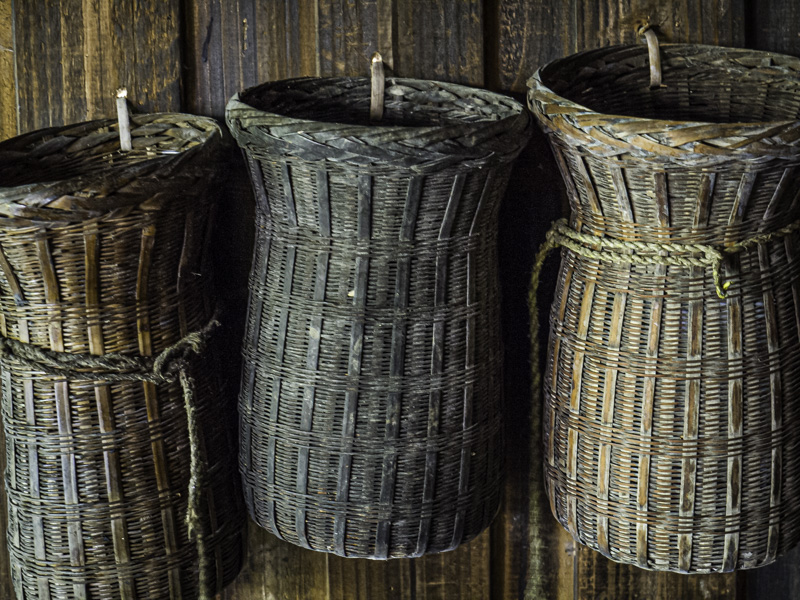
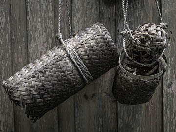
Original digital captureWhat I saw that I liked:Handicrafts at a native village in China. What I don't like in the picture:Rules of Thumb don't guarantee a good photograph, but they became Rules of Thumb because they must offer something of value. For example, compositions with even-numbered items are not a strong as compositions with an odd number of items. What I learned:The one above is not a "balanced" as the one at left. That said, the one above is at lest in sharp focus. Why I thought f/5.6 would be enough depth of field for the one at left is a mystery to me. Any time we get closer, the depth of field gets shallower. I know this. So chalk this one up to a simple boneheaded mistake. 2nd Chances: What I might try nextI wonder what would happen if I placed this into a Photoshop layer, aggressively uprezed and sharpend that middle object, and then blended it back into the original? Does that work? |


