Every Picture Is a Compromise
Lessons from the Also-rans
Most photography websites show the photographer's very best work. Wonderful. But that's not the full story of a creative life. If we want to learn, we'd better pay attention to the images that aren't "greatest hits" and see what lessons they have to offer. Every picture is a compromise — the sum of its parts, optical, technical, visual, emotional, and even cosmic – well, maybe not cosmic, but sometimes spiritual. Success on all fronts is rare. It's ok to learn from those that are not our best.
This is a series about my also-rans, some of which I've been able to improve at bit (i.e., "best effort"), none of which I would consider my best. With each there are lessons worth sharing, so I will.
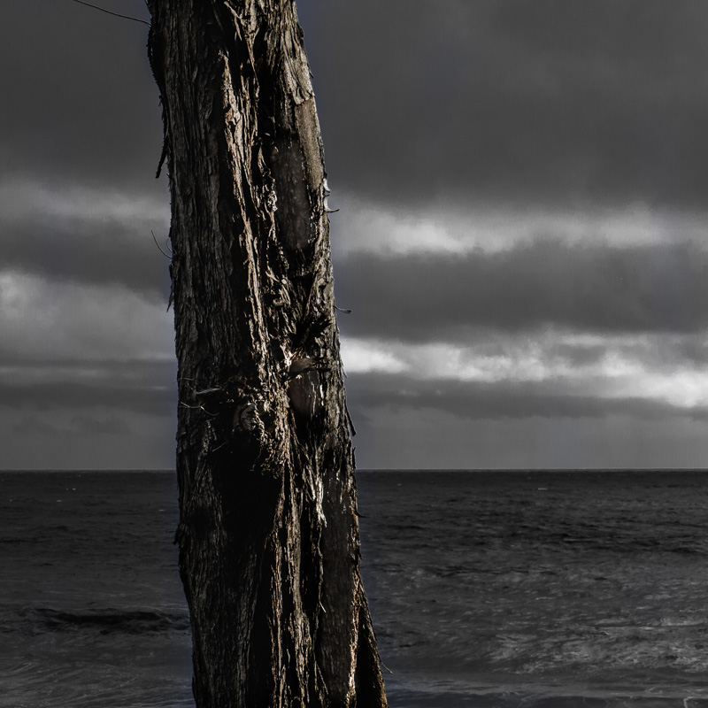
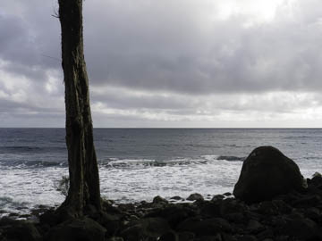
Original digital captureWhat I saw that I liked:And speaking of trees at the shore (see yesterday's example), here is another fun tree . . . What I don't like in the picture:. . . and another boring photograph. What I learned:A lot of landscape photography is about the scene. For me, however, I find more creative fun in the details of the landscape. The one above is "the scene" but the one at left is alive. Not sure I'd call it a great photograph, but if I wanted to share only one of them with you to express my feelings of that moment, I'd choose the one at left for sure. In artmaking, feeling trumps fact every time. 2nd Chances: What I might try nextThis one makes a terrific small print. I need to use it in a chapbook somewhere. |


