Every Picture Is a Compromise
Lessons from the Also-rans
Most photography websites show the photographer's very best work. Wonderful. But that's not the full story of a creative life. If we want to learn, we'd better pay attention to the images that aren't "greatest hits" and see what lessons they have to offer. Every picture is a compromise — the sum of its parts, optical, technical, visual, emotional, and even cosmic – well, maybe not cosmic, but sometimes spiritual. Success on all fronts is rare. It's ok to learn from those that are not our best.
This is a series about my also-rans, some of which I've been able to improve at bit (i.e., "best effort"), none of which I would consider my best. With each there are lessons worth sharing, so I will.
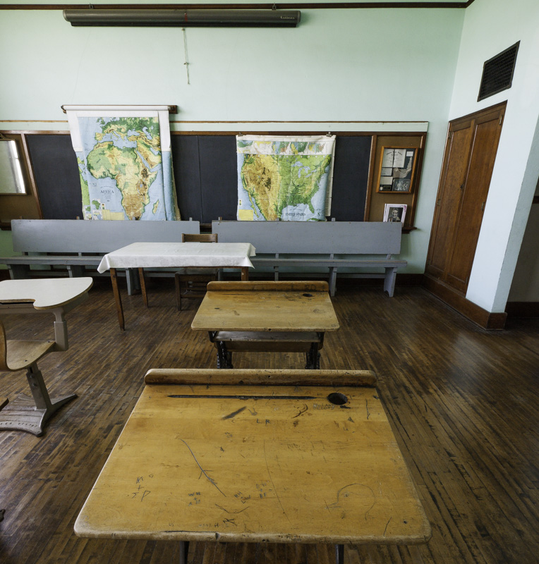
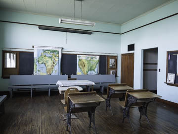
Original digital captureWhat I saw that I liked:So let's pretend you are in this old prairie school and you want to make a photograph that gives you a feeling of having been there back then. What I don't like in the picture:The one above is so — objective, so factual, so third-party observer. It shows the place, but not the experience. What I learned:The one at left is from the point of view of a student. It's much more experiential. In truth, I think both photographs have a place and a purpose; they are just different. I've always felt that "nostalgia" photographs have the primary purpose of transporting us back in time. They are experiential. The one above might be a better photograph for a documentarian or an historian, but the one at left is much stronger as a nostalgia experience. 2nd Chances: What I might try nextI really wish I'd had the presence of mind to pull down that map/projector screen that's closest to the ceiling. It could have filled that empty wall space a bit. |


