Every Picture Is a Compromise
Lessons from the Also-rans
Most photography websites show the photographer's very best work. Wonderful. But that's not the full story of a creative life. If we want to learn, we'd better pay attention to the images that aren't "greatest hits" and see what lessons they have to offer. Every picture is a compromise — the sum of its parts, optical, technical, visual, emotional, and even cosmic – well, maybe not cosmic, but sometimes spiritual. Success on all fronts is rare. It's ok to learn from those that are not our best.
This is a series about my also-rans, some of which I've been able to improve at bit (i.e., "best effort"), none of which I would consider my best. With each there are lessons worth sharing, so I will.
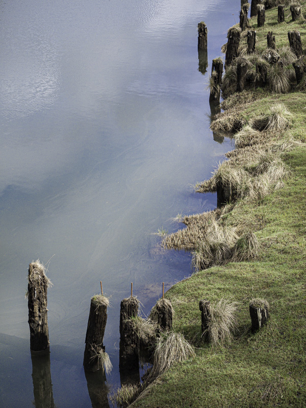
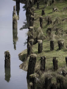
Original digital captureWhat I saw that I liked:Old pilings at the water's edge seem like a can't miss proposition. What I don't like in the picture:Nonetheless, the one above misses. Ugh. Sometimes I have no explanation for the messes I create. I was drunk. Except I don't drink. Uh, . . .I was distracted when Elvis rode by on his unicorn. What I learned:Isn't it interesting how moving just a few feet in one direction or another can completely change a composition? The one at left won't win any blue ribbons, but at least it introduces a more interesting diagonal line and had a better visual anchor in that lower left corner. 2nd Chances: What I might try nextReally long shutter speed to blur out the ripples in water's surface? |


