Every Picture Is a Compromise
Lessons from the Also-rans
Most photography websites show the photographer's very best work. Wonderful. But that's not the full story of a creative life. If we want to learn, we'd better pay attention to the images that aren't "greatest hits" and see what lessons they have to offer. Every picture is a compromise — the sum of its parts, optical, technical, visual, emotional, and even cosmic – well, maybe not cosmic, but sometimes spiritual. Success on all fronts is rare. It's ok to learn from those that are not our best.
This is a series about my also-rans, some of which I've been able to improve at bit (i.e., "best effort"), none of which I would consider my best. With each there are lessons worth sharing, so I will.
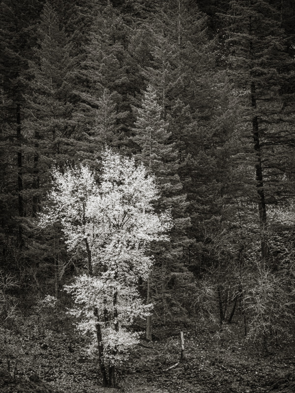
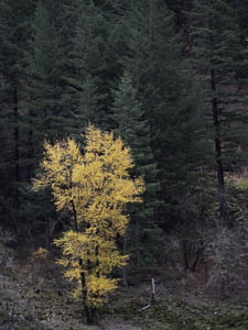
Original digital captureWhat I saw that I liked:Yellow leaves on parade. What I don't like in the picture:The old maxim proposes that we can't see the forest for the trees. Boy is that true in this case. I remember at the moment I was there with the camera to my eye, the debate had already started as whether this was a color image, or a b/w one. Once I got it loaded into Lightroom, the debate continued and I made both versions. I went back and forth for weeks as to which one I liked better. I couldn't decide. I dropped it and didn't think about it again for almost a year. What I learned:I ran across the image a year later and realized my mistake. The question I'd been consumed with was all about color versus b/w. It never occurred to me to ask if it was an interesting photograph, well-composed, and emotionally moving — which it isn't. The background is too busy, the tree trunk is too close to the edge, the shape of the tree is sort of blah, and the odd angle of looking down on the tree from my vantage point on the road gives the image an odd perspective. 2nd Chances: What I might try nextThe only thing I might try next is to crop it to square and try to darken the green forested background a lot. Probably won't work, but worth a try. |


