Every Picture Is a Compromise
Lessons from the Also-rans
Most photography websites show the photographer's very best work. Wonderful. But that's not the full story of a creative life. If we want to learn, we'd better pay attention to the images that aren't "greatest hits" and see what lessons they have to offer. Every picture is a compromise — the sum of its parts, optical, technical, visual, emotional, and even cosmic – well, maybe not cosmic, but sometimes spiritual. Success on all fronts is rare. It's ok to learn from those that are not our best.
This is a series about my also-rans, some of which I've been able to improve at bit (i.e., "best effort"), none of which I would consider my best. With each there are lessons worth sharing, so I will.
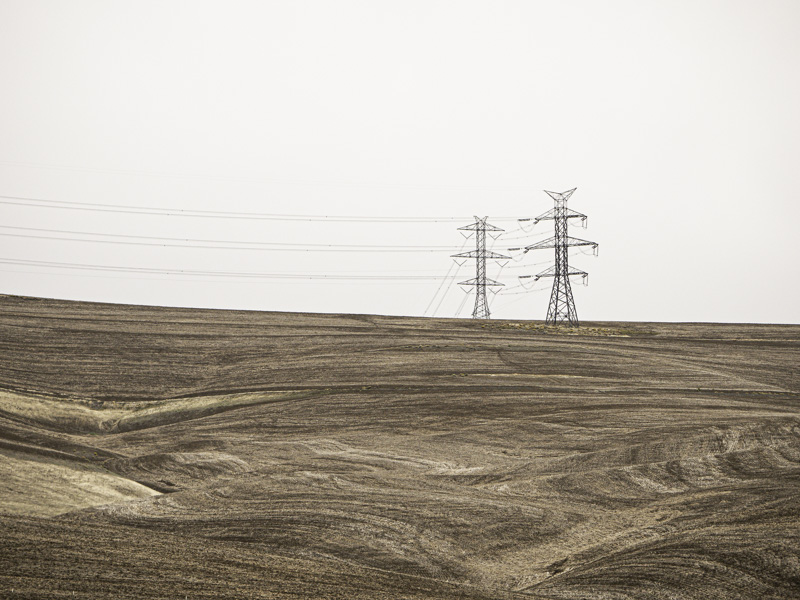
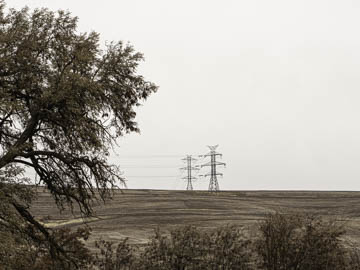
Original digital captureWhat I saw that I liked:The field and power lines. So why did I include the trees? What I don't like in the picture:I can be overly ambitious on occassion and try to say too much in one photograph. Complexity can be both a virtue and an over-reach. What I learned:I think in general, I prefer to say one thing well rather than three things poorly. I'm not convinced the one at left is a "good photograph," but at least it doesn't suffer from the confusion that plagues the one above. 2nd Chances: What I might try nextNot sure I need all that sky at the top. |


