Every Picture Is a Compromise
Lessons from the Also-rans
Most photography websites show the photographer's very best work. Wonderful. But that's not the full story of a creative life. If we want to learn, we'd better pay attention to the images that aren't "greatest hits" and see what lessons they have to offer. Every picture is a compromise — the sum of its parts, optical, technical, visual, emotional, and even cosmic – well, maybe not cosmic, but sometimes spiritual. Success on all fronts is rare. It's ok to learn from those that are not our best.
This is a series about my also-rans, some of which I've been able to improve at bit (i.e., "best effort"), none of which I would consider my best. With each there are lessons worth sharing, so I will.
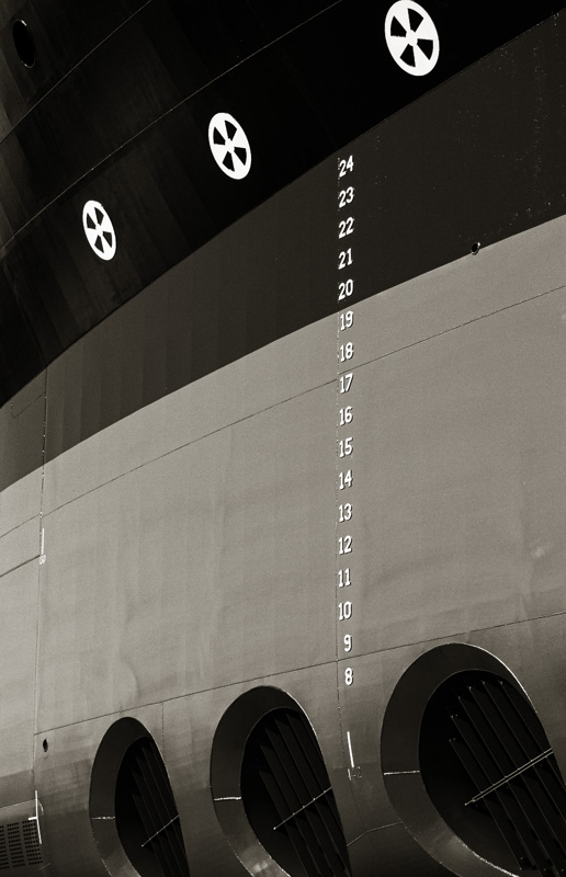
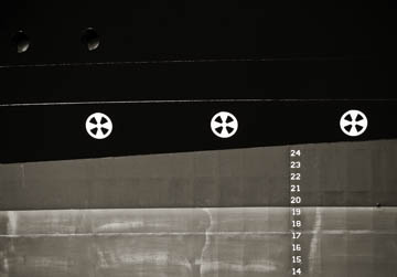
Original digital captureThis week I'm looking back at my photographs from the Dakota Creek Shipyard in Anacortes. What I saw that I liked:Once I started to simplify the compositions, I looked more and more for this kind of image. What I don't like in the picture:The one above is tightly composed, but does nothing to indicate the scale of this huge ship. What I learned:The one at left is the first image from the shipyard that I considered a success. It simplified the chaos while demonstrating the scale of this towering structure — literally. To this day, one of my favorites from the shipyard. 2nd Chances: What I might try nextAs an aside, this image was made on my 10th trip into the shipyard. It is image #1,830 from the project. Sometimes it takes a while to figure out what I'm supposed to be doing. Just to put that number in context, the last image I made there was #10,040. |


