Every Picture Is a Compromise
Lessons from the Also-rans
Most photography websites show the photographer's very best work. Wonderful. But that's not the full story of a creative life. If we want to learn, we'd better pay attention to the images that aren't "greatest hits" and see what lessons they have to offer. Every picture is a compromise — the sum of its parts, optical, technical, visual, emotional, and even cosmic – well, maybe not cosmic, but sometimes spiritual. Success on all fronts is rare. It's ok to learn from those that are not our best.
This is a series about my also-rans, some of which I've been able to improve at bit (i.e., "best effort"), none of which I would consider my best. With each there are lessons worth sharing, so I will.
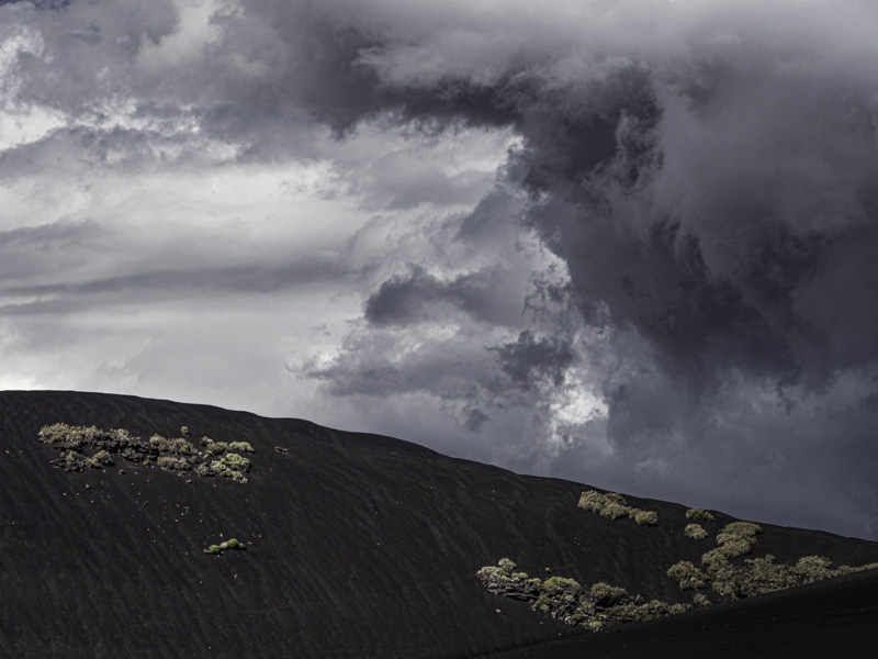
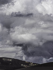
Original digital captureWhat I saw that I liked:Massive storm cloud over a barren landscape. What I don't like in the picture:To be honest, I like both versions. What I learned:Often, I think about horizontal/vertical decisions based on the subject. But there's more to it than that. Consider these two photographed just 15 second apart. To me, the vertical one above seems more about the clouds and it's less "threatening." It's emotionally a bit more neutral. The one at left is much more "confrontational" and emotionally charged. It's not that one is better than the other, but rather that they are different. Both feel like useable photographs that I will include in a project — but different projects. Isn't it interesting how a simple shift from horizontal to vertical can change our emotional interpretation of a subject so markedly? 2nd Chances: What I might try nextDo the clouds have too much blue/purple in them? I might want to reduce the blue/purple saturation a bit. |


