Every Picture Is a Compromise
Lessons from the Also-rans
Most photography websites show the photographer's very best work. Wonderful. But that's not the full story of a creative life. If we want to learn, we'd better pay attention to the images that aren't "greatest hits" and see what lessons they have to offer. Every picture is a compromise — the sum of its parts, optical, technical, visual, emotional, and even cosmic – well, maybe not cosmic, but sometimes spiritual. Success on all fronts is rare. It's ok to learn from those that are not our best.
This is a series about my also-rans, some of which I've been able to improve at bit (i.e., "best effort"), none of which I would consider my best. With each there are lessons worth sharing, so I will.
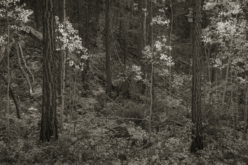
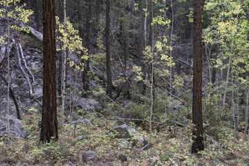
Original digital captureFailures in the WoodsThis week's podcast at www.lenswork.com discusses different strategies for different landscapes. Dovetailing with those thoughts, this week I'll illustrate the challenges of photographing in the woods. What I saw that I liked:A "quiet light" forest scene with some fall colors. What I don't like in the picture:The one above illustrates the problem that has been the theme of this week — too much cacophony. It almost hurts my eyes because there is simply too much going on. Trees, rocks, green leaves, yellow leaves, branches — MAKE IT STOP! What I learned:Converting to b/w can sometimes be the answer. In the version at left, I used the HSL sliders to push greens and blues into the darker tones and then pulled the yellow leaves out to make them the subject. Still pretty busy, but a lot better than the natural color version above. 2nd Chances: What I might try nextMaybe pushing clarity down could help this a bit more. I need to try that next. |


