Every Picture Is a Compromise
Lessons from the Also-rans
Most photography websites show the photographer's very best work. Wonderful. But that's not the full story of a creative life. If we want to learn, we'd better pay attention to the images that aren't "greatest hits" and see what lessons they have to offer. Every picture is a compromise — the sum of its parts, optical, technical, visual, emotional, and even cosmic – well, maybe not cosmic, but sometimes spiritual. Success on all fronts is rare. It's ok to learn from those that are not our best.
This is a series about my also-rans, some of which I've been able to improve at bit (i.e., "best effort"), none of which I would consider my best. With each there are lessons worth sharing, so I will.
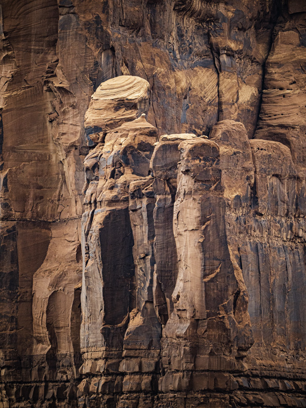
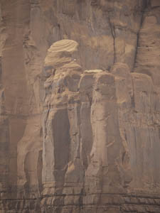
Original digital captureSomething from NothingI used to search for the perfect image in nature. I'd walk by subjects that seemed blasé — foolishly and naively ignoring the possibilites in post-processing that might make something from nothing. This week, I'll show examples that demonstrate why we should always shoot compositionally interesting images even if the tones in the image would seem to offer nothing of interest. What I saw that I liked:This wall of red rock in Monument Valley caught my attention. What I don't like in the picture:Flat, lifeless light on a hazy day of smoky skies. What I learned:In my youth, I wouldn't have bothered to make the image above because the light was so bad. Fortunately, I outgrew that ignorance. I now look for compositions first, and light second. I can process for contrast, color, and even light. If the composition excites me, I make the exposure and hope for some processing success to make a finished image. Why not make the exposure? What have you got to lose — except 100% of the possibilities you might discover in processing. 2nd Chances: What I might try nextThere is some purple in the image at left that might stand a little increase saturation. Gotta try that. |


