Every Picture Is a Compromise
Lessons from the Also-rans
Most photography websites show the photographer's very best work. Wonderful. But that's not the full story of a creative life. If we want to learn, we'd better pay attention to the images that aren't "greatest hits" and see what lessons they have to offer. Every picture is a compromise — the sum of its parts, optical, technical, visual, emotional, and even cosmic – well, maybe not cosmic, but sometimes spiritual. Success on all fronts is rare. It's ok to learn from those that are not our best.
This is a series about my also-rans, some of which I've been able to improve at bit (i.e., "best effort"), none of which I would consider my best. With each there are lessons worth sharing, so I will.
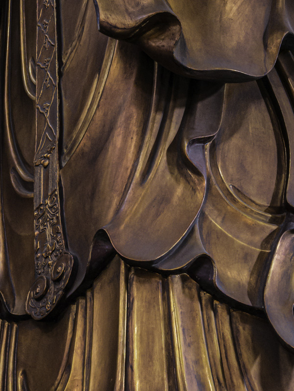
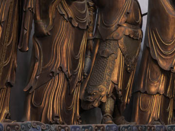
Original digital captureWhat I saw that I liked:I thought the golden robes on these statues in a Chinese monestary were beautiful. What I don't like in the picture:The above shows the context, but not the details. The one at left shows the details, but not the context. What I learned:My first inclination with the above was to simply make a giant print. At then it would show the details. But then it occurred to me that this is a more universal challenge in photography than I'd first thought. Maybe this is a case where a triptych or even a grid might make sense. 2nd Chances: What I might try nextI sure wish I had a sharper image. These were all made at relatively slow shutter speeds (1/6th sec) using a monopod. They lack a touch of crispness in the details that I think would make a better photograph. Also, the one at left was shot at f/16 to get sufficient depth of field and exhibits a bit of softness due to diffraction. |


