Every Picture Is a Compromise
Lessons from the Also-rans
Most photography websites show the photographer's very best work. Wonderful. But that's not the full story of a creative life. If we want to learn, we'd better pay attention to the images that aren't "greatest hits" and see what lessons they have to offer. Every picture is a compromise — the sum of its parts, optical, technical, visual, emotional, and even cosmic – well, maybe not cosmic, but sometimes spiritual. Success on all fronts is rare. It's ok to learn from those that are not our best.
This is a series about my also-rans, some of which I've been able to improve at bit (i.e., "best effort"), none of which I would consider my best. With each there are lessons worth sharing, so I will.
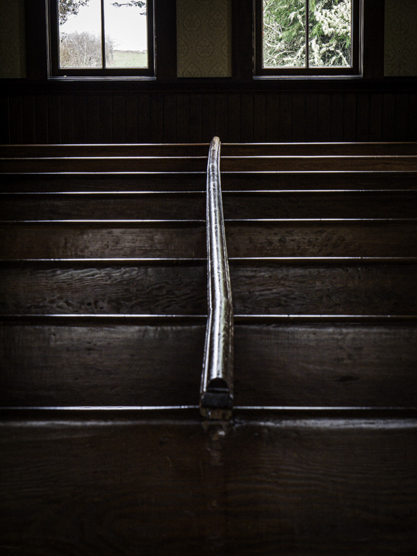
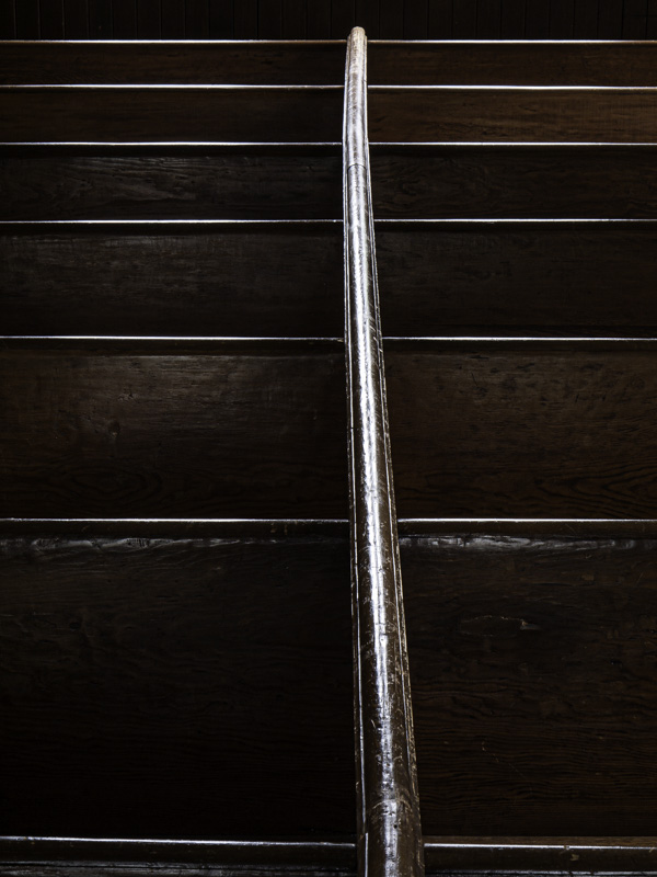
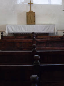
Original digital captureWhat I saw that I liked:May of 2013, at San Juan Bautista in central California. I liked this idea of the center march up the pews to the altar. What I don't like in the picture:It's ok, but not a strong as the one at left. What I learned:March 2011. This is the church at Oysterville, Washington. The strong linear composition with that central rail and the 8 rows of pews is stronger than the one above. 2nd Chances: What I might try nextFocus stacking. The out of focus pews in the bottom third of the image make this a loser. I did an alternative composition of just the center rail (left, below). Maybe I could merge the two so I'd have sharply focused rail and the windows above? |


