Every Picture Is a Compromise
Lessons from the Also-rans
Most photography websites show the photographer's very best work. Wonderful. But that's not the full story of a creative life. If we want to learn, we'd better pay attention to the images that aren't "greatest hits" and see what lessons they have to offer. Every picture is a compromise — the sum of its parts, optical, technical, visual, emotional, and even cosmic – well, maybe not cosmic, but sometimes spiritual. Success on all fronts is rare. It's ok to learn from those that are not our best.
This is a series about my also-rans, some of which I've been able to improve at bit (i.e., "best effort"), none of which I would consider my best. With each there are lessons worth sharing, so I will.
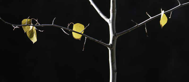
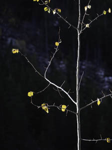
Original digital captureWhat I saw that I liked:Every aspen is a potential photograph. Every single one. What I don't like in the picture:When I travel in the landscape, most often I'm looking for a place, rather than a composition. The one above is a sweet little tree, nice light, punctuating leaves, but a lousy composition. What I learned:Just because the tree itself is a vertical structure doesn't mean the photograph should be a vertical aspect ratio. This panorama crop at left is a much stronger image. More intense, more balance with fewer leaves. 2nd Chances: What I might try nextI could bring out a tad more detail in the background. Hmmmm. . . |


