Every Picture Is a Compromise
Lessons from the Also-rans
Most photography websites show the photographer's very best work. Wonderful. But that's not the full story of a creative life. If we want to learn, we'd better pay attention to the images that aren't "greatest hits" and see what lessons they have to offer. Every picture is a compromise — the sum of its parts, optical, technical, visual, emotional, and even cosmic – well, maybe not cosmic, but sometimes spiritual. Success on all fronts is rare. It's ok to learn from those that are not our best.
This is a series about my also-rans, some of which I've been able to improve at bit (i.e., "best effort"), none of which I would consider my best. With each there are lessons worth sharing, so I will.
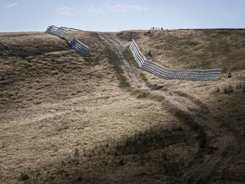
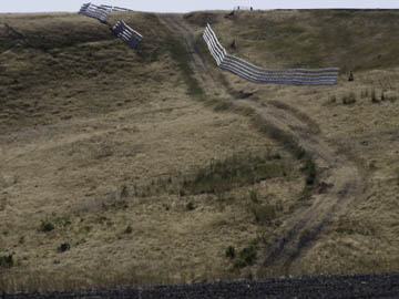
Original digital captureWhat I saw that I liked:Snow fence on a hot summer day. What I don't like in the picture:First ideas are not always the best ideas. I thought this image would work best if I placed the fence as close as possible to the upper edge of the image. Clearly I was wrong. What I learned:To make matters worse, I didn't see that this positioning brought a portion of the gravel road into the bottom edge of the image. This is one of the reasons I prefer using the LCD screen rather than the EVF for composing and positioning. There are too many times I just miss something on the edges when I use the EVF. Maybe this is because I wear glasses, but I'm not positive about that. 2nd Chances: What I might try nextI love that little puffy cloud in the center of the scene. Could I make that stand out more by pushing Clarity up a bit? |


