Every Picture Is a Compromise
Lessons from the Also-rans
Most photography websites show the photographer's very best work. Wonderful. But that's not the full story of a creative life. If we want to learn, we'd better pay attention to the images that aren't "greatest hits" and see what lessons they have to offer. Every picture is a compromise — the sum of its parts, optical, technical, visual, emotional, and even cosmic – well, maybe not cosmic, but sometimes spiritual. Success on all fronts is rare. It's ok to learn from those that are not our best.
This is a series about my also-rans, some of which I've been able to improve at bit (i.e., "best effort"), none of which I would consider my best. With each there are lessons worth sharing, so I will.
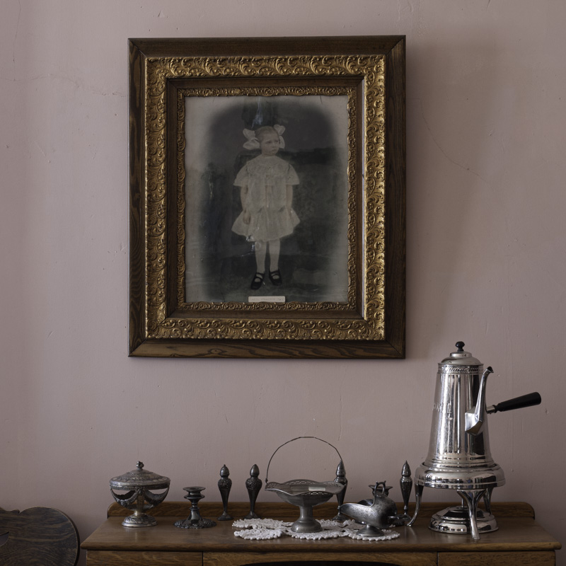
Original digital captureWhat I saw that I liked:In the historic Ansorge Hotel. Quaint scene dripping with nostalgia. What I don't like in the picture:Unfortunately, nostalgia wasn't the only thing dripping; the reflection of the window off-screen to the left made a reflection in the glass of the framed photograph that looks — at least to my eye — like some bird had pooped on the little girl in the picture. What I learned:I tried my best to clone out the white poop-reflection using Lightroom's clone tool, but just doesn't have enough finesse to do the job. The image at left created with Lightroom seems crude — it's especially obvious if you look at the larger view. This is an example illustrating the occasional necessity of porting an image over to Photoshop and using it's more sophisticated tools. I love Lightroom for 95% of what I do, but sometimes I just need the horsepower of Photoshop. 2nd Chances: What I might try nextAs long as I'm going to clone repairs over in Photoshop, why not clone out that chair in the lower left corner? |


