Every Picture Is a Compromise
Lessons from the Also-rans
Most photography websites show the photographer's very best work. Wonderful. But that's not the full story of a creative life. If we want to learn, we'd better pay attention to the images that aren't "greatest hits" and see what lessons they have to offer. Every picture is a compromise — the sum of its parts, optical, technical, visual, emotional, and even cosmic – well, maybe not cosmic, but sometimes spiritual. Success on all fronts is rare. It's ok to learn from those that are not our best.
This is a series about my also-rans, some of which I've been able to improve at bit (i.e., "best effort"), none of which I would consider my best. With each there are lessons worth sharing, so I will.
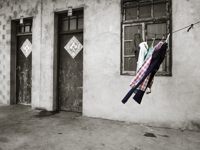
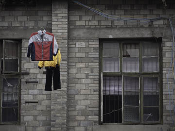
Original digital captureWhat I saw that I liked:Believe it or not, this is a full color picture. From my trip to China in 2009. What I don't like in the picture:I've never used the above image in any project, but . . . What I learned:. . . it was the inspiration for a project that appeared in Kokoro titled, Hung to Dry. (See image at left.) Evidently they don't use clothes dryers in China. Everyone hangs their clothes out to dry. Remembering the image above that looked like selective color, I created Hung to Dry using exclusively selective color. This is another reason I'm an advocate for spending creative time just browsing through your Lightroom catalog. You never know what ideas my pop out and lead you to a project idea. |


