Every Picture Is a Compromise
Lessons from the Also-rans
Most photography websites show the photographer's very best work. Wonderful. But that's not the full story of a creative life. If we want to learn, we'd better pay attention to the images that aren't "greatest hits" and see what lessons they have to offer. Every picture is a compromise — the sum of its parts, optical, technical, visual, emotional, and even cosmic – well, maybe not cosmic, but sometimes spiritual. Success on all fronts is rare. It's ok to learn from those that are not our best.
This is a series about my also-rans, some of which I've been able to improve at bit (i.e., "best effort"), none of which I would consider my best. With each there are lessons worth sharing, so I will.
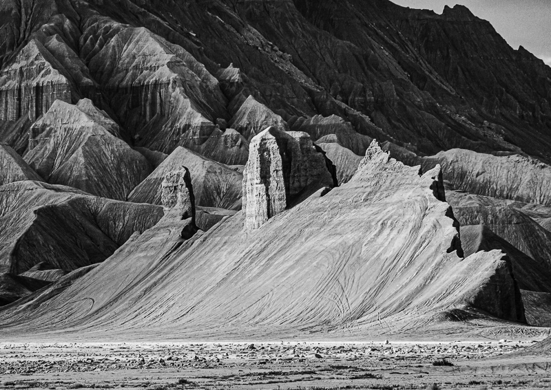
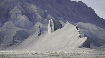
Original digital captureWhat I saw that I liked:Curious shape in the sands near Factory Butte in Utah. A comment about titles:I suppose I could follow the standard titling scheme and call the above something like, "Sand sculpture, near Factory Butte, Utah, 2013." No one would complain. But such flat descriptions seem to squeeze the life right out of any sense of imagination that could be called to mind. I much prefer a more imaginative title — not what it is, but what it looks like. Perhaps, "Desert Wave" might work. Or maybe I should let your imagination decide what this looks like. One thing for sure, if I title it with a dry description, I'll discourage you from thinking of it any differently than how my title describes it. Titles are tricky things. They steer thought into grooves that can limit the artwork's possible interpretations. |


