Every Picture Is a Compromise
Lessons from the Also-rans
Most photography websites show the photographer's very best work. Wonderful. But that's not the full story of a creative life. If we want to learn, we'd better pay attention to the images that aren't "greatest hits" and see what lessons they have to offer. Every picture is a compromise — the sum of its parts, optical, technical, visual, emotional, and even cosmic – well, maybe not cosmic, but sometimes spiritual. Success on all fronts is rare. It's ok to learn from those that are not our best.
This is a series about my also-rans, some of which I've been able to improve at bit (i.e., "best effort"), none of which I would consider my best. With each there are lessons worth sharing, so I will.
|
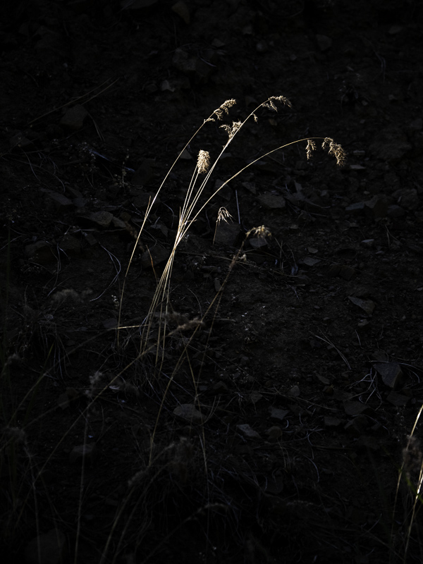
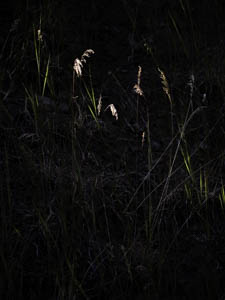
Original digital captureWhat I saw that I liked:Sunbeam on some fall grasses, against a dark hillside in the shadow. What I don't like in the picture:The above was my first attempt. The problem is that the various stalks of grass are unrelated. I've often said that photography is about relationships. Then I make a crummy compositional choice like this. Geez. What I learned:Next, I did the one at left. Much better. They relate to one another. Well, except for those invaders in the lower right edge. Aaaarrgh. Content aware fill to the rescue in the image at lower left. That's what I wanted! 2nd Chances: What I might try nextThere is still one illuminate stalk at the base that is horizontal. Maybe I should clone that one out, too. |


