Every Picture Is a Compromise
Lessons from the Also-rans
Most photography websites show the photographer's very best work. Wonderful. But that's not the full story of a creative life. If we want to learn, we'd better pay attention to the images that aren't "greatest hits" and see what lessons they have to offer. Every picture is a compromise — the sum of its parts, optical, technical, visual, emotional, and even cosmic – well, maybe not cosmic, but sometimes spiritual. Success on all fronts is rare. It's ok to learn from those that are not our best.
This is a series about my also-rans, some of which I've been able to improve at bit (i.e., "best effort"), none of which I would consider my best. With each there are lessons worth sharing, so I will.
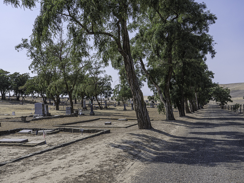
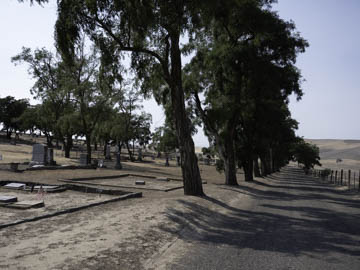
Original digital captureWhat I saw that I liked:Cemeteries in the desert. What's not to like? What I don't like in the picture:I've always had a very keen sense of balance. I attribute this as the cause for my preference for rectilinear lines — horizons, buildings, trees, etc. What I learned:Every once in a while, I find a subject like this that has no rectilinear lines anywhere. The road tilts right, the trees tilt left, the headstones tilt all which ways, the distant horizon runs downhill toward the right. There is nothing to base "level" on in the entire scene. Without a subject to guide us, we have to just feel our way into it. I tried to level an all the above and most of them made me feel dizzy. The only one that sort of felt less nausea-inducing than the others is this one at left where I rectified the road. Place your bets and take your chances! 2nd Chances: What I might try nextOne thing I did not try was morphing the image in Photoshop. Might be worth a try. |


