Every Picture Is a Compromise
Lessons from the Also-rans
Most photography websites show the photographer's very best work. Wonderful. But that's not the full story of a creative life. If we want to learn, we'd better pay attention to the images that aren't "greatest hits" and see what lessons they have to offer. Every picture is a compromise — the sum of its parts, optical, technical, visual, emotional, and even cosmic – well, maybe not cosmic, but sometimes spiritual. Success on all fronts is rare. It's ok to learn from those that are not our best.
This is a series about my also-rans, some of which I've been able to improve at bit (i.e., "best effort"), none of which I would consider my best. With each there are lessons worth sharing, so I will.
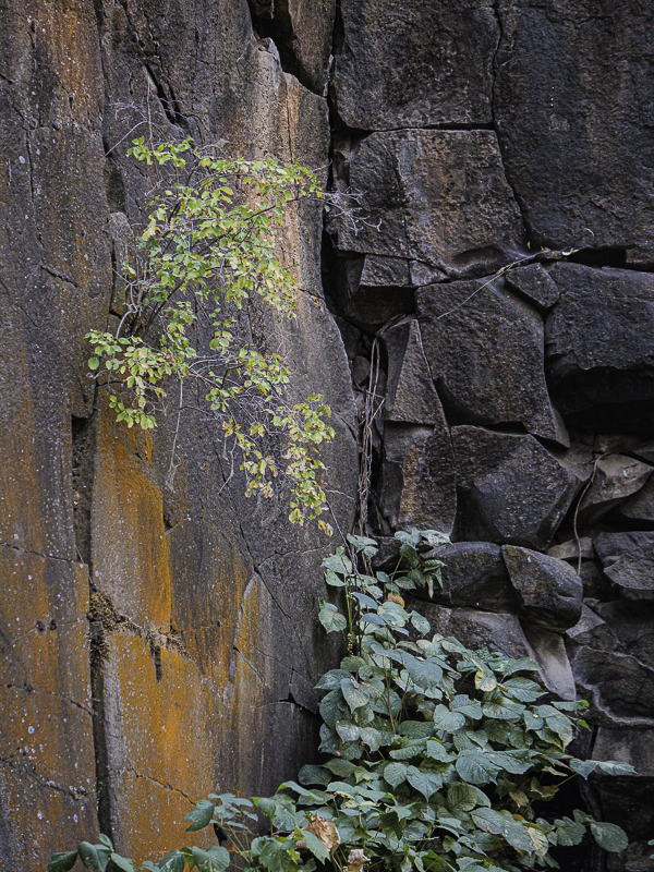
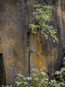
Original digital captureWhat I saw that I liked:Colorful rock wall. What I don't like in the picture:I've spent so much of my creative life photographing walls and other flat surfaces that I've slipped into a habit — a bad habit — of facing them straight on at a perpendicular angle. The shot above demonstrates that habit. Not a good photograph. Flat, boring, geometric, and flat. Did I mention flat? What I learned:Photographs being two-dimensional objects can very often benefit by tricking our eye to see them as three-dimensional images. That subtle leading line in the green leaves at left help turn this into something not a flat as the above. The orange susbstance on the rocks become even more visible, too. Still not a great photograph, but a lot better than that flat piece of flatness above. 2nd Chances: What I might try nextI think this one could benefit from a slightly dark vignette in the corners to lead our eye "in." |


