Every Picture Is a Compromise
Lessons from the Also-rans
Most photography websites show the photographer's very best work. Wonderful. But that's not the full story of a creative life. If we want to learn, we'd better pay attention to the images that aren't "greatest hits" and see what lessons they have to offer. Every picture is a compromise — the sum of its parts, optical, technical, visual, emotional, and even cosmic – well, maybe not cosmic, but sometimes spiritual. Success on all fronts is rare. It's ok to learn from those that are not our best.
This is a series about my also-rans, some of which I've been able to improve at bit (i.e., "best effort"), none of which I would consider my best. With each there are lessons worth sharing, so I will.
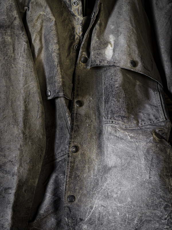
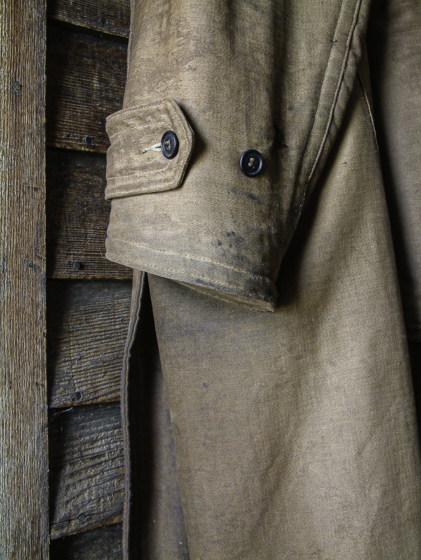
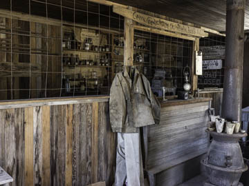
Original digital captureWhat I saw that I liked:You can see the place in the image above. How many separate images could you make there? The possibilites seem almost endless. What I don't like in the picture:The overall scene above is not my preference, at least not in general. I am drawn to details, like the one at left. What I learned:After I was home and working on this day's shoot, I realized I had other images of old coats. Why? What is it about them that is so interesting? This is exactly the type of question that nudges me to a project. Come to find out, I have a couple dozen shots of old coats that might become a small project. Now all I have to do is figure out why they facinate me and what I might have to say about them. BTW, the image below at left is an earlier version from 2003. The one above it is from 2017. Sometimes projects requires years of gathering before you even realize you are doing so. 2nd Chances: What I might try nextipsom |


