Every Picture Is a Compromise
Lessons from the Also-rans
Most photography websites show the photographer's very best work. Wonderful. But that's not the full story of a creative life. If we want to learn, we'd better pay attention to the images that aren't "greatest hits" and see what lessons they have to offer. Every picture is a compromise — the sum of its parts, optical, technical, visual, emotional, and even cosmic – well, maybe not cosmic, but sometimes spiritual. Success on all fronts is rare. It's ok to learn from those that are not our best.
This is a series about my also-rans, some of which I've been able to improve at bit (i.e., "best effort"), none of which I would consider my best. With each there are lessons worth sharing, so I will.
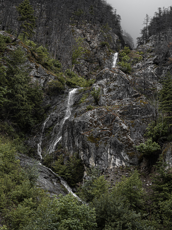
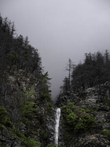
Original digital captureWhat I saw that I liked:Cute waterfall on an overcast day. What I don't like in the picture:Why the h--- did I think it was a good idea to show so much of the bland sky and truncate the waterfall? Let's see. . . I was scared of the wild bear to my left, yeah, that was it. What I learned:A while back I learned a neat trick using the Callibration Panel in Lightroom. Slide the Blue Primary channel's Hue control to the left to reduce the blue in the image and it warms it in way that is different than changing the color balance in the Basic panel. Try it. I love this shift, particularly in an image like this one that doesn't have a lot of blue in it anyway. 2nd Chances: What I might try nextDo you see that tree in the upper left that is leaning to the right? I think that tree makes this entire composition feel like it is leaning to the right. The camera was level, but it sure doesn't feel like that. Optial illusion. |


