Every Picture Is a Compromise
Lessons from the Also-rans
Most photography websites show the photographer's very best work. Wonderful. But that's not the full story of a creative life. If we want to learn, we'd better pay attention to the images that aren't "greatest hits" and see what lessons they have to offer. Every picture is a compromise — the sum of its parts, optical, technical, visual, emotional, and even cosmic – well, maybe not cosmic, but sometimes spiritual. Success on all fronts is rare. It's ok to learn from those that are not our best.
This is a series about my also-rans, some of which I've been able to improve at bit (i.e., "best effort"), none of which I would consider my best. With each there are lessons worth sharing, so I will.
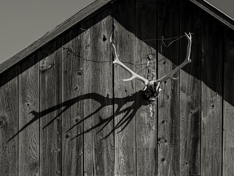
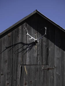
Original digital captureWhat I saw that I liked:Quintessentially the Old West. What I don't like in the picture:The one above is the "obvious" composition, the one that is the knee-jerk response. But, what does the door in the bottom quarter of the image add to the scene? What I learned:To me, it seems pretty obvious that this image is all about the horns and its shadow. That led me to the not obvious, not centered, not bilaterally symmetric composition at left. Much better. And notice how much more the texture and grain of the barn wood pops out, too, because of the closer view. It's okay to make the obvious picture, but don't stop then. The next step is to try to distill to the essence by eliminating the unnecessary. 2nd Chances: What I might try nextDoes the wire add an interesting element, or should I try to clone it out? |


