Every Picture Is a Compromise
Lessons from the Also-rans
Most photography websites show the photographer's very best work. Wonderful. But that's not the full story of a creative life. If we want to learn, we'd better pay attention to the images that aren't "greatest hits" and see what lessons they have to offer. Every picture is a compromise — the sum of its parts, optical, technical, visual, emotional, and even cosmic – well, maybe not cosmic, but sometimes spiritual. Success on all fronts is rare. It's ok to learn from those that are not our best.
This is a series about my also-rans, some of which I've been able to improve at bit (i.e., "best effort"), none of which I would consider my best. With each there are lessons worth sharing, so I will.
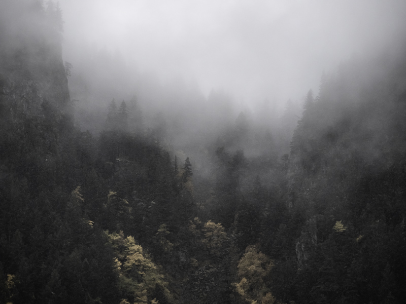
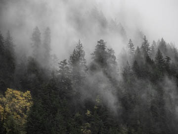
Original digital captureWhat I saw that I liked:Neither of these moody images is great, but they do illustrate a point. What I don't like in the picture:In the one above, that fall colored tree in the lower left corner combines with the line of trees to pull our eye out the left side of the image. On greased skids. What I learned:The image at left has exposure problems, but at least the canyon walls on both the left and right sides keep our eye from wandering out of the frame like we do in the above. 2nd Chances: What I might try nextTo salvage the one at left will require a lot of rabbits emerging from hats. No idea how this got so underexposes, but pulling enough out of those shadows is going to stress the limits of my processing abilities. |


